
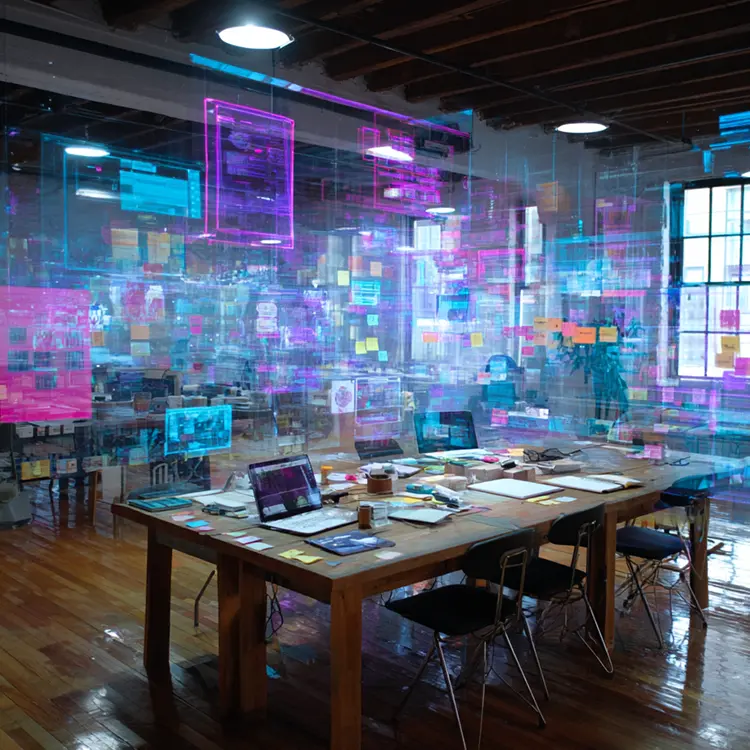
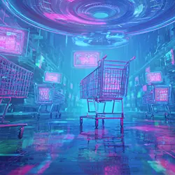
UI UX Design Services:
Dashboard & Product Design
Welcome to What'zhat Agency's space dedicated to UI UX design best practices.
A Complete Guide to UI UX, Design, and Dashboards
Here we speak the truth, we explain what works, we show how we design interfaces and dashboards that actually serve the users and business objectives.
If you are looking for a optimal user experience, practical support for the product design on delivery and dashboards that make data useful — you've come to the right place.
This page is designed to answer all your questions about ui ux, ux ui, product design and the dashboard: methods, deliverables, case studies, prototyping, user testing, eco-design and KPIs.
It is also designed to be an actionable resource: you can read it as a checklist or keep it as a reference for your next product projects.
Summary: What you will find here

UI / UX: Quick Definitions
What is UX design?
The Ux (User Experience), or user experience, is the invisible heart of a digital product. It encompasses everything related to the user journey: logic, fluidity, efficiency, and above all, usefulness. Good UX isn't just about making a site "nice": it's about solving real problems.
Imagine you're entering a train station. You quickly find your platform, and the signs and arrows are clear, the signage is intuitive, and the route is straightforward. You arrive calmly, stress-free. This is successful UX design.
In the digital world, the role of UX is exactly the same: to anticipate needs, reduce friction, and simplify users' lives. It's not about "cosmetic" design, but rather psychology, ergonomics and product strategy.
What is UI design?
The Ui (User Interface) is the visible layer, the aesthetic dressing that gives shape to this experience thought out in advance. UI design is the equivalent of the illuminated signs in the train station, the colors that differentiate the subway lines, the buttons that we press without hesitation.
Concretely, the UI includes buttons, typography, colors, icons, animations, and interactive components. It is what allows the user to read, understand, and act naturally. The UI does not create logic, but it translates the UX strategy into readable and usable interfaces.


Why ux ui together (or ui ux)?
UX and UI design are often compared to an orchestra and its score. UX is the composition, the musical logic; UI is the interpretation by the musicians, the emotion felt in the audience. One without the other remains incomplete.
- A Solid UX without clear UI It's like a super-efficient instruction manual, but written in tiny, illegible print.
- A Beautiful UI without UX It's like a luxury car without an engine: beautiful to look at, but impossible to use on a daily basis.
The marriage of UX and UI is the basis of everything successful product designThis is what transforms a digital tool (website, web applications, software or mobile app) into a product that users like to use, recommend and keep over time.

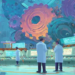
Our UI UX design services for an optimal user experience (detailed)
UX research & product strategy (UX design)
Before we design any interface or dashboard, we start by listening. user interviews, targeted surveys, field observations… These steps allow us to delve into the reality of your users and provide insight into how to improve the user experience.
Why do they make these decisions? Where do they give up? What hidden frustrations don't show up in the numbers?
From these insights, we define a clear product strategy, which aligns your business objectives with the real needs of users (condition for success). This step is what makes all the difference between a "nice" product and a really adopted.

Co-design workshops (best practices) (UX design)
At our agency, we believe that the best ideas rarely come about alone. co-design workshops bring together your teams, our designers and sometimes even your users around the table.
With tools like the empathy mapthe user journey or even the crazy 8's, our team brings out the dashboard of your users' needs and the associated creative solutions, while ensuring that everyone is moving in the same direction.
The result: you not only get a product designed for your users, but also a strong stakeholder buy-in (creation of a community around the product).
Wireframes & flows (interface strategy) (UX design)
Wireframes are the product skeletonsNo colors, no flashy visuals: just the essentials. This phase allows you to define the structure, information hierarchy, and navigation flows.
By investing time here, you drastically reduce the risk of costly redesigns later. It's better to correct a logical error in a sketch than in a product that's already been developed.

Interactive prototyping (low → high fidelity) (UI design)
Moving from concept to action. prototyping Brings wireframes to life. In low-fidelity, this methodology allows for rapid testing of logic. In high-fidelity, the prototype looks almost like the final application, with realistic interactions.
UI UX prototyping to validate before IT development
An interactive UI/UX prototype allows you to validate choices in real-life conditions before committing to weeks of development. It avoids costly corrections once development has begun.
High-fidelity prototypes to refine ergonomics
High-fidelity prototypes allow for testing of usability, micro-interactions, content and performance before going into production.
A well-built prototype is a powerful communication tool: your investors, customers or technical team immediately understand what you are trying to build.
User testing & iterations (UI design)
We put prototypes into the hands of real users. And that's often where the magic (and surprises) happen. Testing reveals unexpected bottlenecks: a misplaced button, unclear terminology, an unnecessary step that slows down the process.
Identify bottlenecks
Each test helps identify friction in the journey and actionable insights : errors, delays, misunderstandings. Then we iterate, we adjust, we simplify. The product becomes more and more intuitive and robust.
Real-life testing
Tests must be done with users that reflect your personas. The feedback obtained must be actionable and prioritized according to impact.
UI design & design systems (Ui design)
Once the experience is validated, we move on to the visual designThis includes creating consistent UI components, implementing accessible color palettes, readable typography, and microinteractions that make usage seamless.
We also develop design systems : Libraries of reusable components that ensure product consistency and accelerate development. It's a way to industrialize design without sacrificing creativity.
Handoff & integration with developers (Project management)
Good design is useless if it's poorly integrated. We prepare organized deliverables (in Figma, with tokens and detailed specs) to make developers' lives easier.
Our role? To avoid the infamous "it's too good to be possible" situation. Through seamless collaboration with your technical team, the gap between the intended design and the final product is minimized.
Product design and continuous optimization (UX UI design)
A digital product is never "finished." After launch, we continue to measure, analyze, and improve. We follow a dashboard of Precise KPIs : adoption, conversion rate, task completion time, retention.
Measuring the impact of changes
A good methodology: measure before/after the changes to prove the impact on theuser experience on a device and KPIs.
These phases provide us with the data needed to quantify the success of your digital product's UI/UX design and thus improve the user experience (UX/UI). Organized in the form of a dashboard, they will also meet marketing needs.
Each iteration makes your product more efficient and better suited to real-world needs. Design isn't a sprint: it's a continuous improvement process, designed to help you grow.

Project management and collaboration
The success of a UX/UI project depends as much on methodology as on creativity. Collaboration between designers, developers, and stakeholders must be structured, transparent, and focused on user value.
Key roles: designers, developers, product owners
Each role has a specific responsibility: designers design, developers implement, and product owners align the business vision with user needs. Together, they create a cohesive and effective product.
Sprints & Iteration Cycles
Projects progress in short cycles. Each sprint allows for tangible value delivery, feedback gathering, and course adjustments. This iterative approach limits risk and accelerates time to market.
Communication with stakeholders
Involving stakeholders throughout the project prevents misunderstandings. Regular reporting, interim demonstrations, and transparency on progress build trust and facilitate decision-making. Project management and collaboration
The success of a UX/UI project depends as much on methodology as on creativity. Collaboration between designers, developers, and stakeholders must be structured, transparent, and focused on user value.


Key roles: designers, developers, product owners
Each role has a specific responsibility: designers design, developers implement, and product owners align the business vision with user needs. Together, they create a cohesive and effective product.
Sprints & Iteration Cycles
Projects progress in short cycles. Each sprint allows for tangible value delivery, feedback gathering, and course adjustments. This iterative approach limits risk and accelerates time to market.
Communication with stakeholders
Involving stakeholders throughout the project prevents misunderstandings. Regular reporting, interim demonstrations, and transparency on progress build trust and facilitate decision-making.
Tools & technologies we use
⛏️ Figma (ux ui design & prototyping)
It's the central tool of our work. It allows us to design, prototype, and collaborate in real time with our clients and developers.
🔨 User testing tools
We use specialized UX UI platforms to recruit testers, record their sessions and analyze their reactions in detail.
🪚 Analytics tools & dashboards
Measuring usage is key to making good decisions. Our integrations allow you to accurately track KPIs and adapt your product model accordingly.
🔧 Collaboration & dev handoff
The transition between design and development is often critical. We use clear plugins and processes to ensure smooth and lossless transmission.
Best practices for UX & UI design
The 6 golden rules:
1- Prioritize clarity over aesthetics (Ux > Ui)
Effective design must first and foremost be clear and understandable. Aesthetics come next to enhance and reinforce the experience.
2- Shorten user journeys (Optimize the user experience as much as possible)
Every click should have a purpose. Reducing unnecessary steps streamlines the experience and increases overall satisfaction.
3- Use reusable components (Branding UI)
Components provide speed and consistency. They allow you to create faster, while ensuring visual consistency (see design system).
4- Document patterns and interactions (feedback)
Best practices should be shared. Documenting behaviors and design choices avoids inconsistencies in the long run.
5- Measure KPIs and iterate (Monitoring)
Design shouldn't remain static. By measuring adoption, retention, and performance, we continually improve the experience. (See measures & expected results)
6- Involve developers early (Project Management)
Collaboration is key. The earlier developers are onboarded, the smoother the transition from design to development.
Personas & user journeys
Building Useful Personas
Personas are your typical users. They synthesize the needs of users and guide the priorities of the design.
Mapping the user journey
The user journey highlights the path that the identified personas will need to follow. This step highlights the key moments of the course (key events) where to intervene.
Usage scenarios & critical tasks
Identify critical tasks to optimize usability and reduce errors. This is where you highlight the core of your product and its true added value.
Design system ux ui & components
A design system is the visual and functional backbone of a digital product. It brings together rules, components, and best practices to ensure lasting consistency and accelerate production. More than just a style guide, it's a strategic tool that guarantees design scalability. It's the graphic charter of your digital product; we recommend our clients add it to their official graphic charter.
- Why a design system?
A design system provides rigor and continuity over time. It reduces inconsistencies, limits implementation errors, and saves the team valuable time. For a growing company, it's a real accelerator.
- Structure of a design system
A well-constructed design system includes a color palette, consistent typography, reusable components (buttons, forms, cards, etc.), tokens (spacing, sizes, styles), and clear documentation. Together, they form a visual language shared by the entire team; it's a valuable tool to share at the beginning of a project.
- Governance and updating
A design system is never static. It must evolve along with the product and its users. Defining who maintains it and how updates are validated helps ensure its long-term relevance.

Eco-design in digital design
Why be interested in eco-design?
The digital sector accounts for a significant share of global emissions. Eco-design aims to reduce this impact.
Eco-design audits
We carry out audits to identify optimization levers (page weight, images, scripts).
Simple routes = digital sobriety
Simplifying interfaces reduces content, the number of interactions and therefore energy consumption.
Responsible technical and visual choices
Limit unnecessary resources, optimize images and prefer lightweight web typography.
Measure & communicate impact
We support the implementation of indicators to monitor the ecological performance of the website or application. This data represents good content for digital marketing.
Accessibility & ergonomics
Accessibility and ergonomics are not optional extras, but rather foundational design principles. They ensure that every user, regardless of ability, background, or device, can use the product effectively and without frustration.
Accessibility standards
Adhering to international standards (WCAG) is essential to making a product inclusive. This means considering color contrasts, text alternatives, keyboard navigation, and screen reader compatibility.
Ergonomics of interactions
Ergonomics focuses on ease of use in everyday life. It involves designing sufficiently large clickable areas, intuitive gestures, and a visual hierarchy that guides the user naturally. This is what transforms a usable product into a pleasant one.

Measures & expected results
A design cannot be judged solely on its aesthetics: it must be evaluated on its actual performance. Measuring, analyzing, and adjusting are the three pillars of a results-oriented UX approach.
Ui Ux KPIs to be defined
Indicators must be precise and actionable. Among the most relevant are: adoption rate, task completion rate, average time to complete an action, and error rate.
Examples of measurable results
Good design can cut the time it takes to complete a task in half, dramatically increase tool adoption rates, or reduce customer support requests. These tangible results justify the investment in design.
How to track results (management tool)
Performance is monitored with analytical tools, A/B testing, and dedicated dashboards. These tools provide a clear view of product development and fuel a continuous improvement loop.
Quick checklist before launching a UX UI project
✅ Defining business objectives
✅ Identify target users
✅ Prioritising essential features
✅ Do a quick technical audit
✅ Provide for regular user testing
✅ Measure and iterate (KPI)
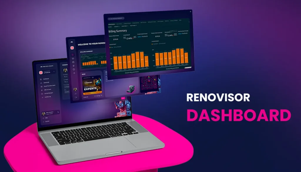
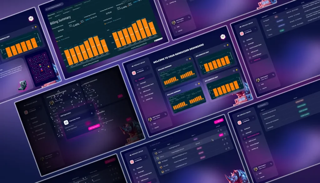
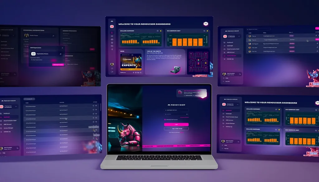
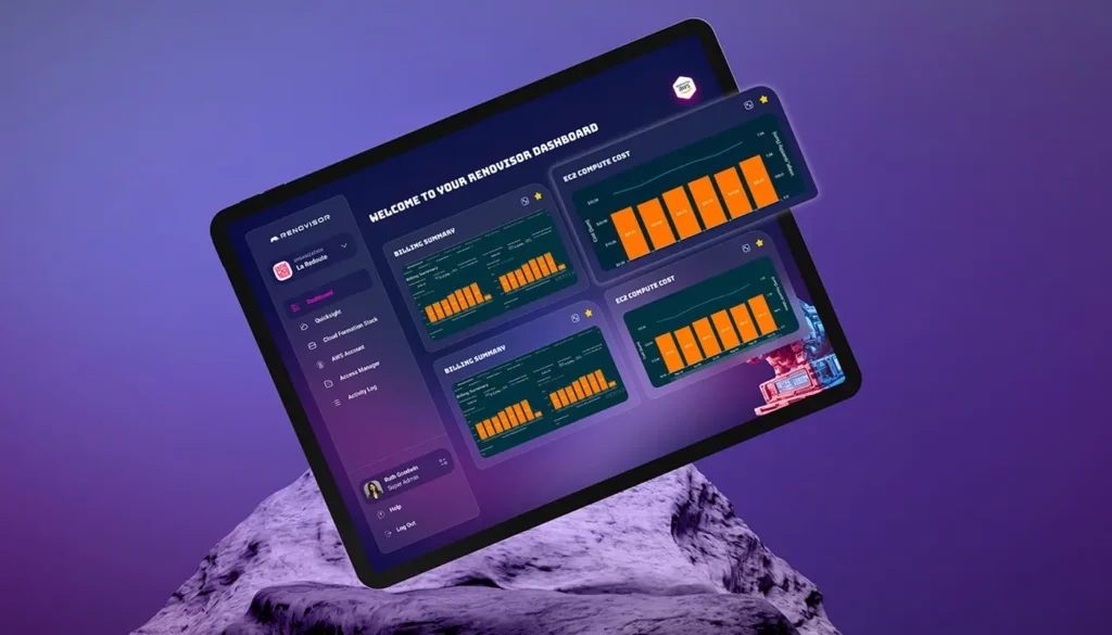
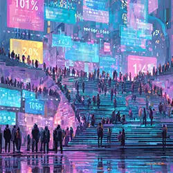
Learn more about dashboard design (Dashboard design Ux Ui)
The dashboard as a decision-making cockpit
A well-designed ui ux dashboard acts like the cockpit of a product. It centralises essential data and indicators, to transform complex information into fast, clear decisions.
Depending on your field and your objectives, your management tool will not display the same content and data. Our team will use its expertise to create a UX/UI dashboard tailored to your needs.
Prioritize relevant information
The strength of a dashboard lies in its ability to simplify. It shouldn't show everything, but only the essentials, providing a readable overview and then details accessible on demand.
Information architecture for dashboards
Architecture is key to avoiding visual overload. It defines a clear hierarchy: a global view at the top, well-organized sections, relevant filters, and smooth navigation for deeper exploration.
Operational vs. Analytical Dashboards
Operational dashboards help track activity in real time, while analytics allow you to step back and analyze trends. Both must be designed with different but complementary logics.

Data visualization and storytelling
A chart should be more than just a visual aesthetic: it should tell a clear, actionable story. Good visualization transforms raw data into concrete insights to guide decision-making.
Interactive filters and controls
Giving users control makes the dashboard more powerful. With filters and interactive options, everyone can explore data according to their needs and get personalized answers.
Colors, palette and visual consistency
Color structures information and aids reading. A consistent and accessible palette helps distinguish visual priorities while ensuring an inclusive experience.
Responsive design for dashboard
A good dashboard must adapt to all screens. From large monitors to smartphones, it must maintain readability and ergonomics to remain useful in all situations.
Feedback: our customer case studies
Inventeeth - Software for dentists and website

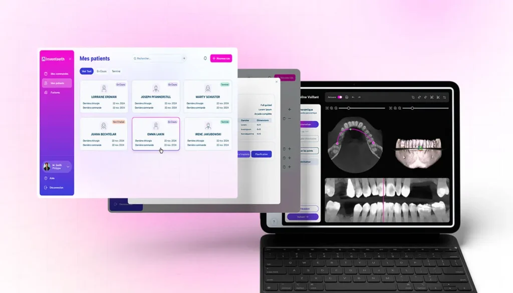
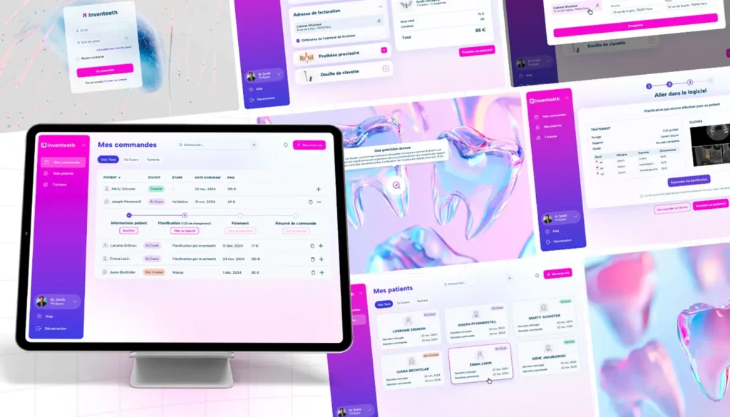

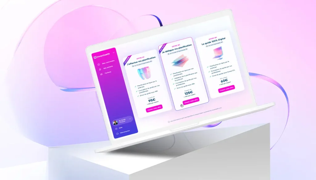
Context
Inventeeth develops surgical planning and implant guide ordering software. Surgeons needed a reliable, simple, and accurate tool that would reduce errors and make their procedures safer.
Approach
We conducted a user research phase in the office : observation of surgeons in real conditions, qualitative interviews, construction of an “expert practitioner under time constraints” persona. Low and then high fidelity prototypes were tested directly in the clinic to validate logic and readability under stress.
Results
- Reduced data entry errors 32 % after 3 months.
- Adoption by 70 % of testing practitioners from the first version.
- Reduced time to order a surgical guide 40 %.
Lessons
By integrating surgeons very early in the design cycle, we have proven that UX is not an aesthetic overlay but a security factor.
Quidli — Gamified app for crypto
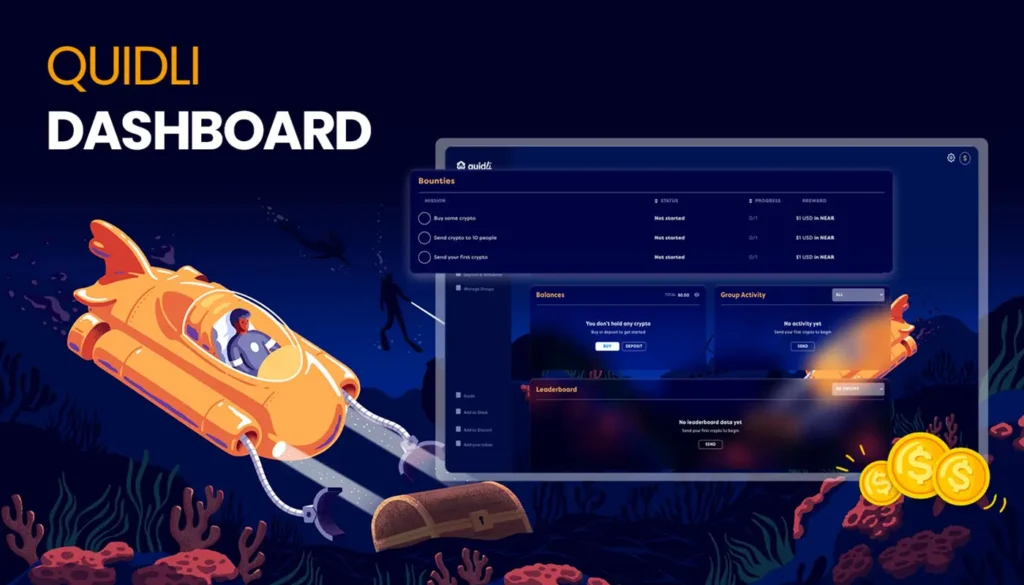
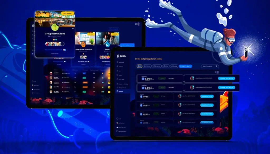
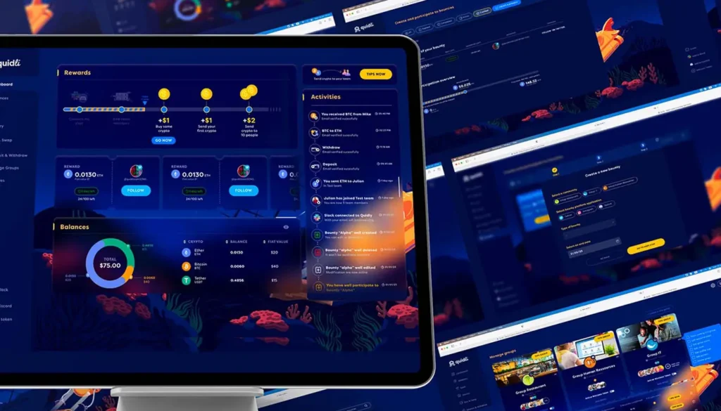
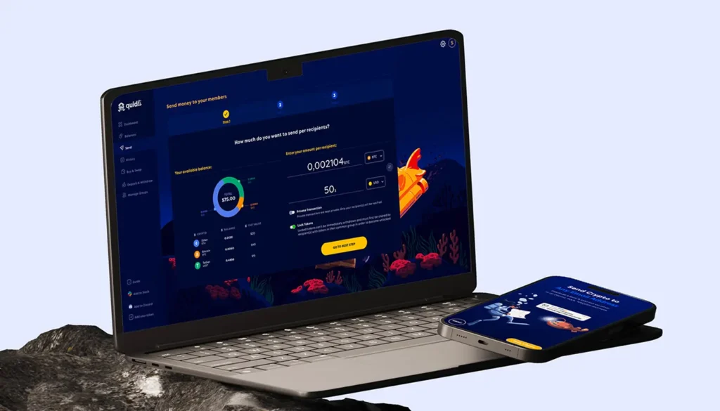
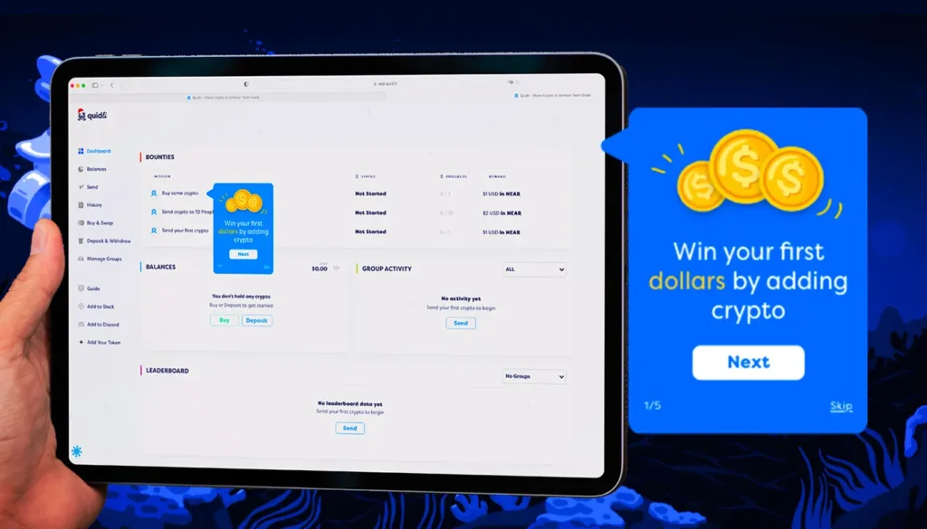
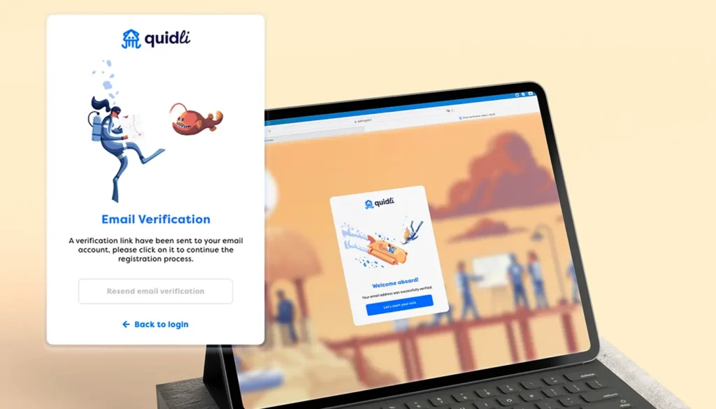
Context
Quidli wanted a business app to distribute cryptocurrency rewards (tips) to your employees. The problem: the crypto world is notoriously complex, and user retention is often low.
Approach
We have integrated gamification mechanics (visual progression, instant feedback, achievement badges), all in a graphic universe inspired by both gaming and crypto culture. The onboarding user experience was built as an interactive tutorial to guide new users without cognitive overload.
Results
- Increase in successful onboarding rate of +45 % in two months.
- Increase in average time spent on the dashboard +28 %.
- 3-month retention rate up by +22 %.
Lessons
When the interface becomes fun, adoption happens naturallyGamification isn't a gimmick: it's a strategy for transforming a complex dashboard into an engaging experience.
HarmonyCell — Health Dashboard
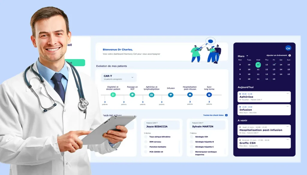
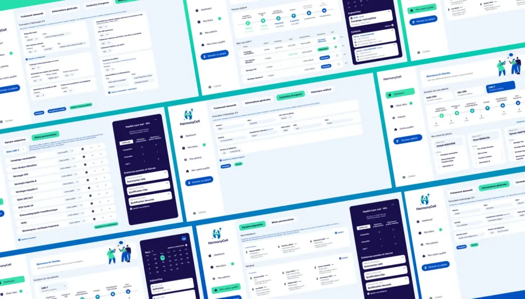
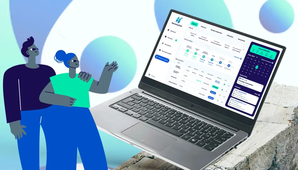
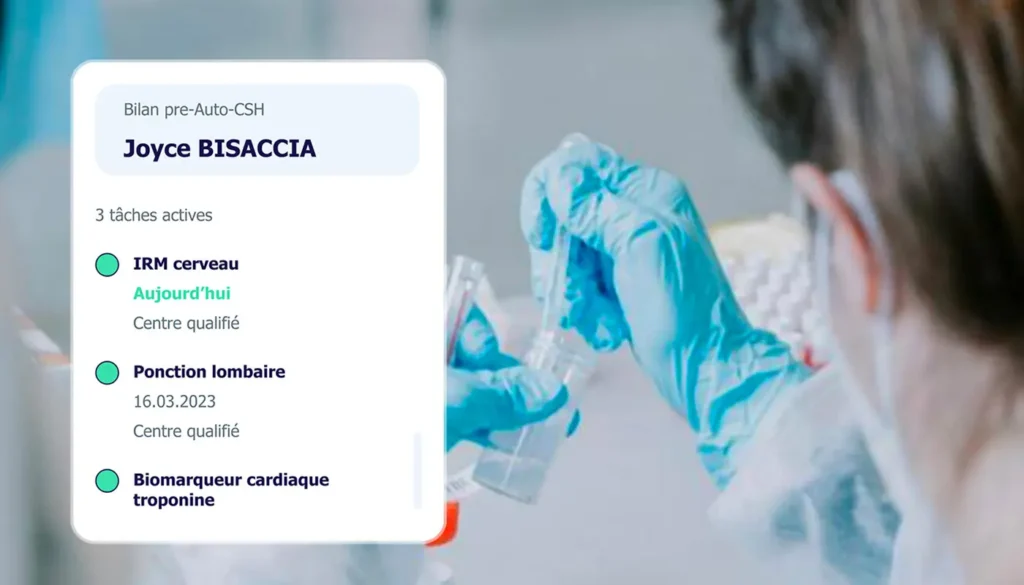
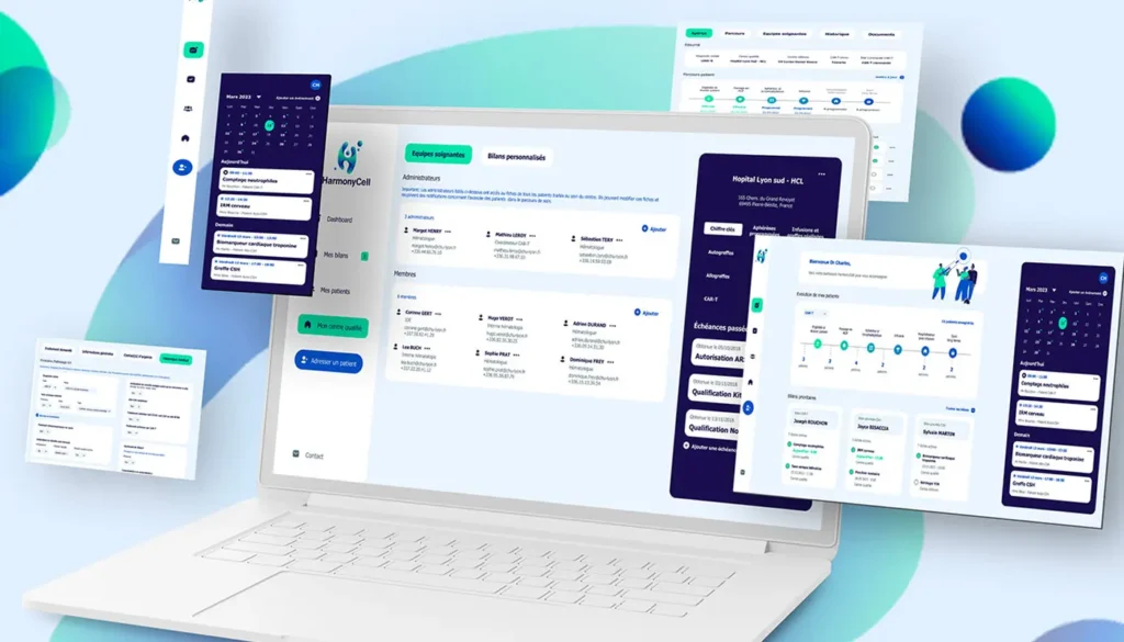
Context
HarmonyCell wanted to centralize patient monitoring and care pathway management. Medical staff needed a simple and reliable interface, as every error could have a critical impact.
Approach
We have designed a clear visual architecture, based on modular cards to prioritize essential information. User tests were conducted with nurses and doctors in near-real-life conditions.
Results
- Reduced data entry errors -27 %.
- Average time saved per user: 12 minutes per patient.
- Better visibility of clinical KPIs, with almost immediate adoption by teams.
Lessons
In health, good design is not a “plus”, but a factor of clinical effectivenessEvery second saved and every mistake avoided counts.
Renova Cloud - Cloud management & costs

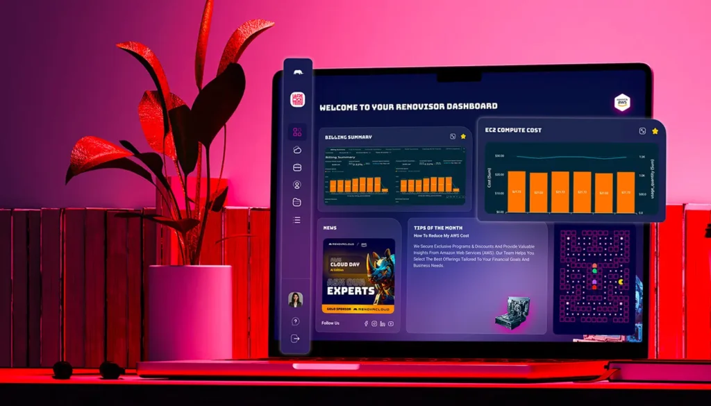
Context
Renova Cloud sought to provide greater visibility into cloud resource consumption and costs. The user profiles varied greatly: CTOs, DevOps, and finance managers.
Approach
We have built personalized views according to roles : an executive view for decision-makers (overall cost vision), and technical drill-downs for DevOps teams. The objective: to make the data readable and actionable for everyone.
Results
- Reduced reporting time by -35 %.
- Accelerated budgetary decision-making +20 %.
- Improved understanding of costs: 84 % users report better identifying areas of overconsumption.
Lessons
A dashboard is not universal: it must be adapted to the role and decision-making level of each user.
Finreka - Gamification of the financing process

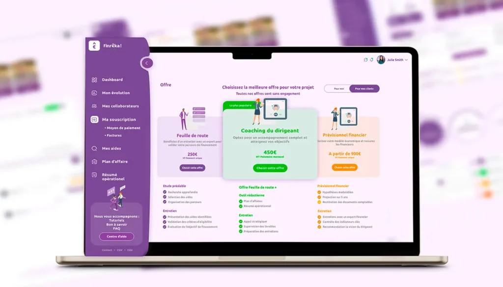
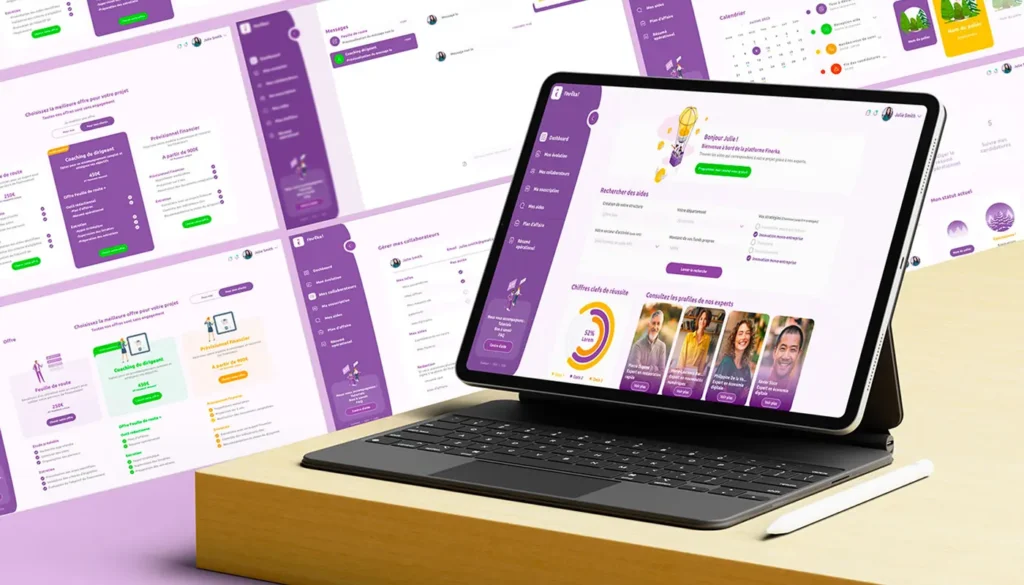
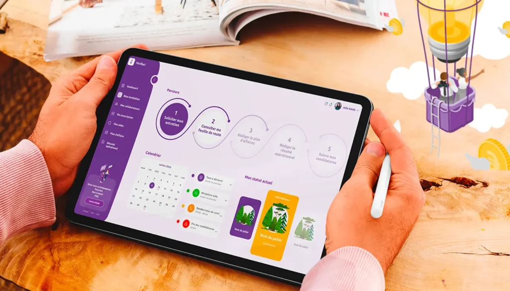

Context
Finreka helps its clients prepare their financing applications. However, this type of process is often perceived as long, cumbersome, and discouraging.
Approach
We transformed the process into interactive game : progression tree, micro-incentives, positive feedback after each step completed. The idea: create a dynamic of motivation by replacing administrative burden with a “level reached” logic.
Results
- Rate of completion of files increased from 52 % to 79 %.
- Average time to finalise a file reduced by -18 %.
- User satisfaction up by +25 % (measured by post-course questionnaires).
Lessons
Even a task perceived as boring can become engaging thanks to gamification. Design can transform user psychology and increase productivity.
Testimonials & customer feedback
What our customers say
Our customers appreciate our ability to transform their needs into clear, tested interfaces.
They highlight the the rigour of our UX approachthe the pedagogy of our supportas well as quality of the prototypes deliveredwhich make it easier to put into production.
Long-term collaboration and support
Over and above the initial project, many people are stressing our role as a long-term partner.
We know how to adapt products to real-life use, remain available and responsive, and develop solutions with their teams to ensure smooth, long-term adoption.

Working with us: a simplified process
Initial contact & scoping
By e-mail, we discuss your objectives, your constraints and your timetable.
Audit & detailed proposal
UX audit, business proposal, roadmap and deliverables.
Kick-off & workshops
Co-design, prioritisation and planning workshops.
Design & testing sprints
Short sprints, prototypes and user tests.
Delivery & support
Delivery of assets, integration support and post-live monitoring.
Prices & packaging (transparent)
Workshop & rapid diagnosis package
UX audit, 1-day workshop, deliverables: roadmap and quick wins. Ideal for testing the value of a project.
Design sprint formula (1-2 weeks)
Functional prototype, rapid testing, decision on product alignment.
Full product formula (3-6 weeks)
Research, prototyping, UI, design system and handoff dev. Suitable for serious projects that want to scale.
Monthly support & ongoing optimisation
Support, A/B testing, progressive improvement of the product and dashboard.

Precise FAQs (Ux, Ui, dashboards)
Do you do any development work?
No, we deliver the specs (via Figma) and support the development, but we can also work with your in-house developers.
How long does it take between the first brief and usable mock-ups?
Depending on the size of the project, between 2 and 6 weeks. Our agile method means we can deliver first versions quickly, so you can react without wasting time.
Should a design system be planned from the outset?
Not always, but it is recommended for projects that need to scale. You can start small and build up over the course of the project.
How can I be sure that my developers will respect your mock-ups?
We deliver under Figma with a complete design system (typos, colours, reusable components). So your devs have all the specifications they need. If required, we can also work with your technical team or audit the live version.
How many tests should be carried out?
As many as you need. In practice, we start with a cycle of 4-8 users and iterate according to the results.
How do I choose which data to include in my dashboard design?
We work with your data teams to define priority sources, KPIs and views.
How does a UX/UI project work in practice with What'zhat?
We follow a clear and transparent process: benchmarking and competitor research, creative moodboarding, definition of user flows, then wireframe design and interactive prototyping in Figma. At each stage, you validate the deliverables before moving forward, so there are no nasty surprises and you retain control of the project.
Can you also help me convince my teams or my managers?
Yes, we prepare interactive mock-ups and prototypes that make the project concrete. This facilitates your internal presentations and speeds up decision-making.
How can I measure the ROI of a UX/UI project?
Good design is measured in concrete results We'll help you define these indicators from the outset, so that your investment has a real business impact. We can help you define these indicators from the outset, so that your investment has a real business impact.
Impact measurement: concrete examples
Conversions & Sales
- E-commerce redesign → +25 to +40 % of conversions in just a few months (businessnewsdesign.com)
- Targeted mobile optimization → +200 % of conversions (seosandwitch.com)
- Supacart → reduction in churn (or attrition rate, users lost over time) by 7.2 % to 1.2 % in 3 months (brandhero.design)
Support & Customer Service
- Flowcode → -50 % of tickets thanks to clearer navigation (alanamacedo.design)
- Buffer → -26 % of tickets following the overhaul of the help centre (lotusthemes.com)
- Microsoft → studies showing on average -30 % support requests (hypersense-software.com)

Internal productivity
- Simplification of interfaces and workflows → +20 to +40 % time saved per task (medium.com)
- Helpdesk.com → ticket resolution time divided by 2 on certain projects
Visibility & Commitment
- Continental Office → +103 % of traffic in one year after redesigning the customer journey (exalt-studio.com)
- Other projects → +84 % average session length and +107 % daily active users (webbb.ai)
- PubMatic → NPS score increased from 6 to 9 in 3 months (sanjaydey.com)
In a nutshell: the levers activated by UX/UI

Ready to improve your user experience?
If you want to know more, click on the phone number (via WhatsApp) or on the e-mail and leave us a message.
We offer you a free diagnosis and a clear proposal to get you started.
Or
📅 Need a dedicated moment?

Why choose us (summary)
Product & design expertise
We combine UX research and UI design to deliver measurable results.
Pragmatic method
Tested prototypes, rapid iterations, focus on users.
Results orientation
We don't work to look pretty: we optimise for use and business performance.
Conclusion: transforming use into value
At What'zhat Agency, our priority is simple: to make theuser experience obvious, useful and enjoyable.
Whether you need a dashboard to manage your operations, a product design to launch a SaaS, or UX optimisation for a website, our approach is focused on the needs of our customers. usersprototyping and testing guarantees concrete results.
If you want to find out moreTo discuss a specific project or receive an audit, write to us - we'll get back to you as soon as possible with a proposal tailored to your needs.
Last word
Design, data, testing and support: the combo that turns an interface into a strategic tool. We're ready to help you achieve optimal user experience.
They tried, they understood
Nice promises are not enough. What counts is real impact. Here, our customers tell us how our methods have transformed their products, their teams and sometimes even their vision.
Here is their raw feedback, the little phrases that show better than we can ourselves the value of our work.

Resources & practical guides
Free templates
Wireframes, checklists and user test templates available on request.
Eco-design guides
Checklist for reducing the footprint of websites and applications.
User test models
Script, scenario, analysis grid to gather usable feedback.
Appendices (technical examples)
Examples of dashboard components
KPI cards, sparklines, dynamic filters, interactive tables.
Recommended patterns for product design
Progressive disclosure, modals vs drawers, sticky headers for navigation.
Typical A/B tests for dashboards
Display variants, KPI visibility, impact of filters on decision time.