Logo de clinique médicale

Création de l’image de marque
Medicenter est venu nous voir car ils cherchaient une image médicale moderne, simple et humaine. Le défi du logo Medicenter était d’être tendance, dynamique et de conserver les codes de santé traditionnel. Fondamentalement, cela signifie garder le bleu, le vert et la croix. Avec ces exigences, nous avons créé une croix composée de carrés turquoises avec des bords arrondis, pour le côté moderne et simple. Ces quatre carrés dessinent la croix, symbolisant le lien entre les différentes compétences humaines du corps médical.
Pour découvrir comment créer un logo, cet article vous dévoilera les astuces essentielles.
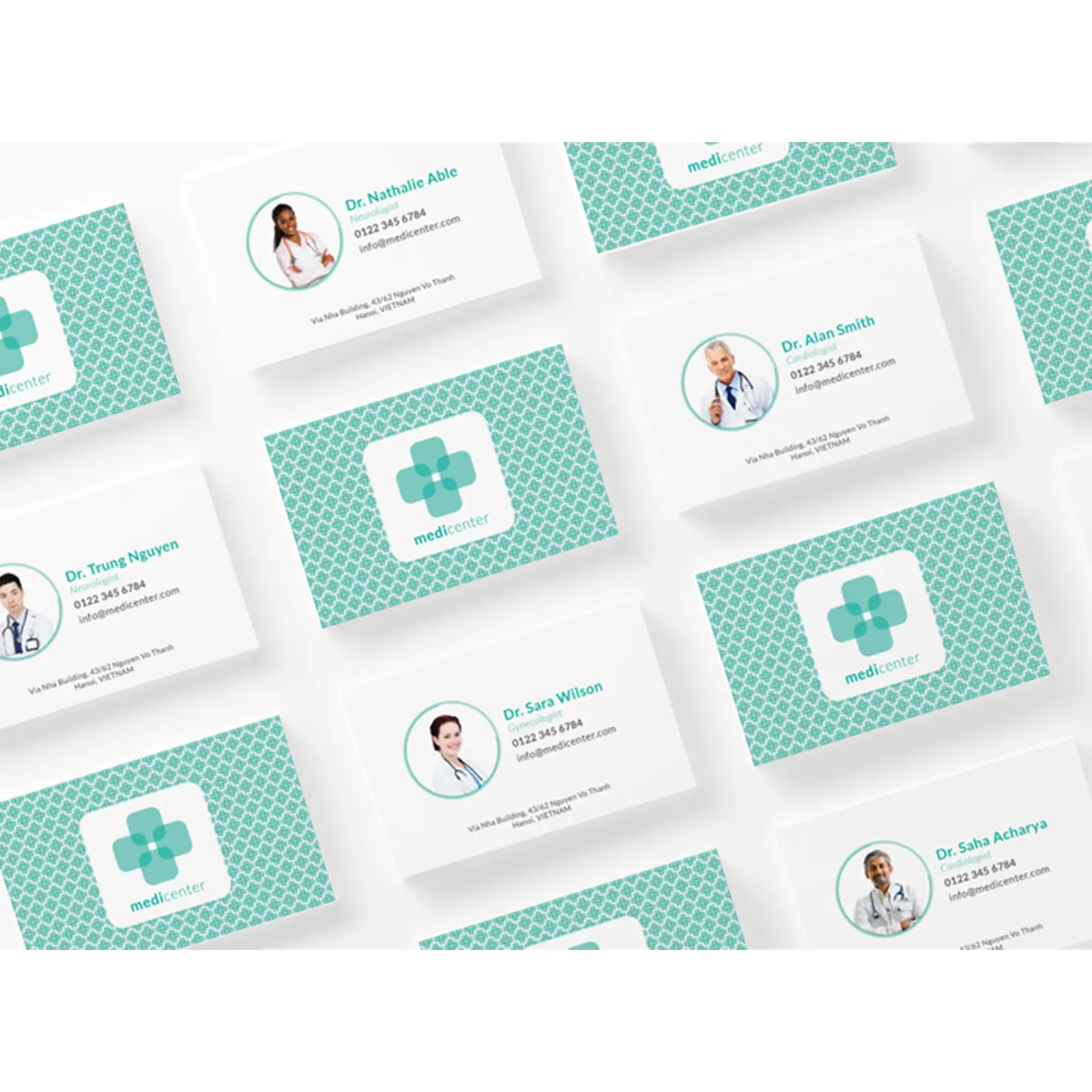
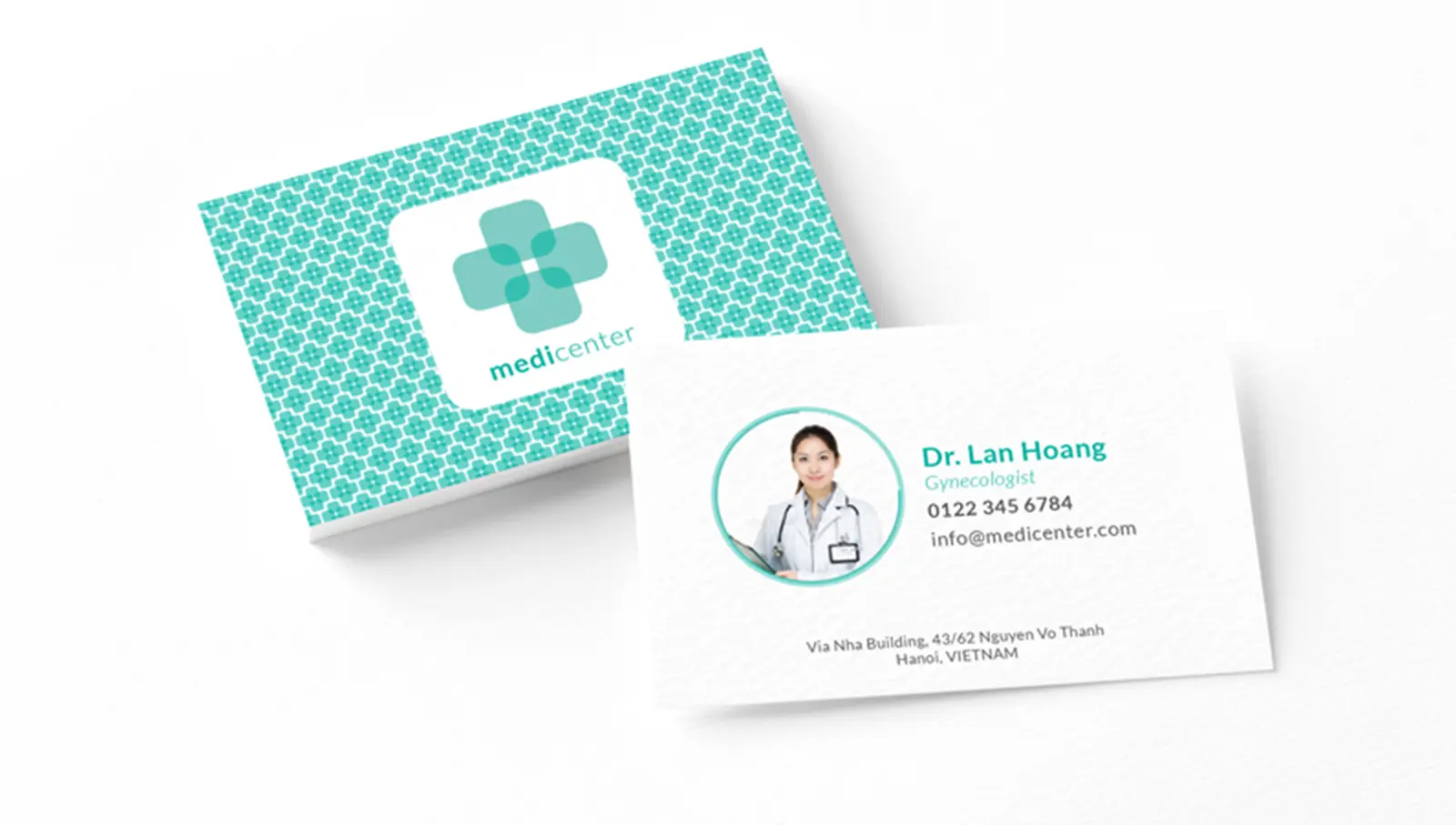
Cartes de visites
Les cartes de visite sont connectées au style du logo afin de renforcer leur image de marque. Nous avons utilisé la croix pour en faire un motif. C’est visuellement accrocheur et vif, ainsi le contact est plus facile à retrouver dans un portefeuille déjà rempli de carte de visites. Pour continuer à exprimer un côté humain au projet, nous avons décidé d’ajouter les photos des médecins directement sur la carte de visite. Grâce à cela, on peut garder ce sentiment de proximité entre le médecin et le client.


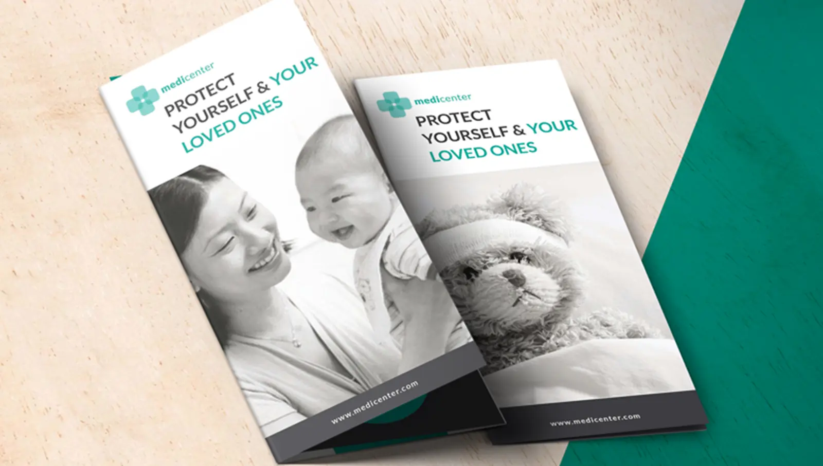
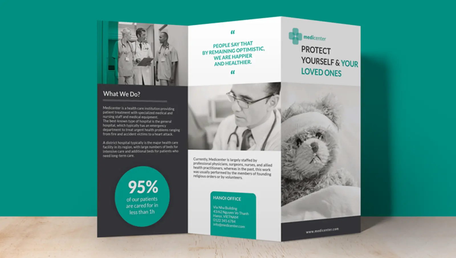
Design de brochure
Cette brochure est disponible dans le hall et dans la salle d’attente. Le but du dépliant en 3 volets est de rassurer le patient et de mettre en évidence certaines des compétences de Medicenter. Pour continuer d’exprimer la proximité avec le client, nous avons donc décidé d’ajouter une grande quantité de photos, des citations de médecins, ainsi que des témoignages de clients. Ce livret descriptif est un objet marketing incontournable pour une entreprise qui reçoit des clients dans ses locaux.