Industrial Communication
Mekong Energy Celebrates 20 Years of Service in Vietnam
To celebrate its two decades of service (2005–2025), Mekong Energy orchestrated a landmark event, combining industrial recognition and social commitment.
Press clippings:
On this occasion, we had the privilege of designing the communication around the twentieth anniversary, with the aim of highlighting the company's remarkable journey and its various successes, from the construction of the power plant to energy production.
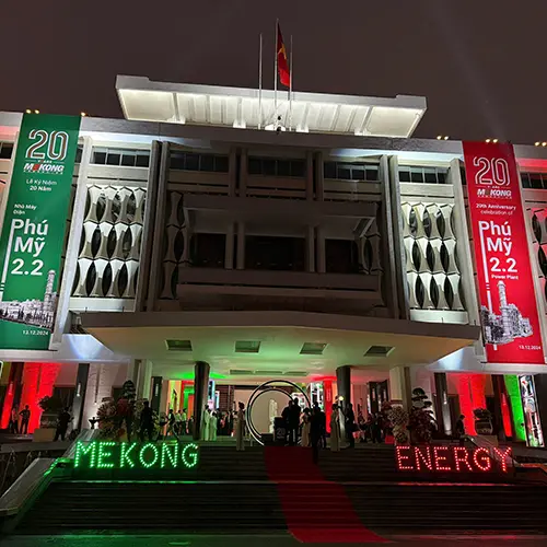
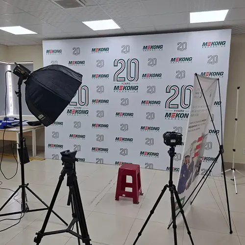
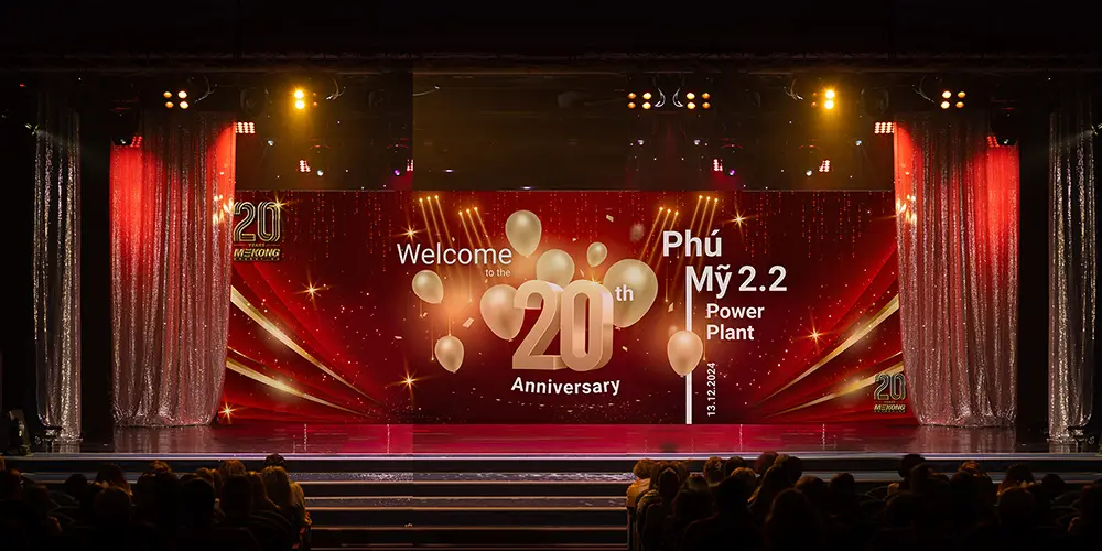
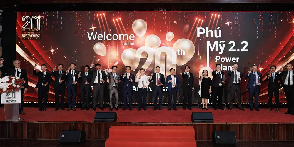
Powerful Event Branding
Our mission was first to build a strong visual identity for this anniversary. Inspired by Mekong Energy’s core values — safety, technical excellence and social responsibility — we developed a comprehensive set of materials:
- Monumental banners: Installed on the façade of the reception venue, they recalled the company's heritage and its investment in Vietnam's energy modernization.
- Backdrop and photobooth: Designed to welcome guests to the gala, they merged Mekong Energy's iconic colors and industrial aesthetics, while remaining warm and festive.
- Special “20 years” logo: Designed to highlight the progress made, it ensured graphic continuity on all media, from invitations to the goodies distributed.
Thanks to this consistent branding, the event was able to convey the strength of the partnerships established by Mekong Energy (with EDF, JERA, EVN, etc.) and recall the company's constant commitment to its employees, partners and local communities.
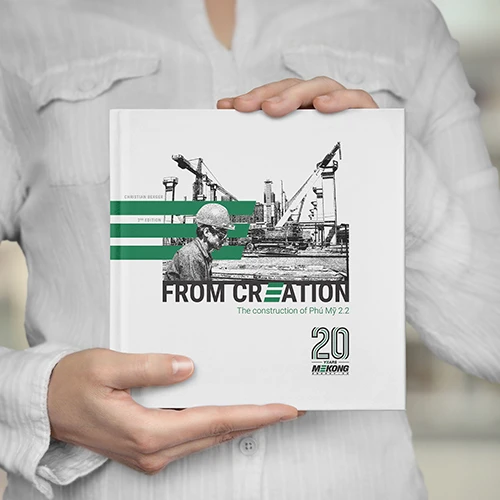
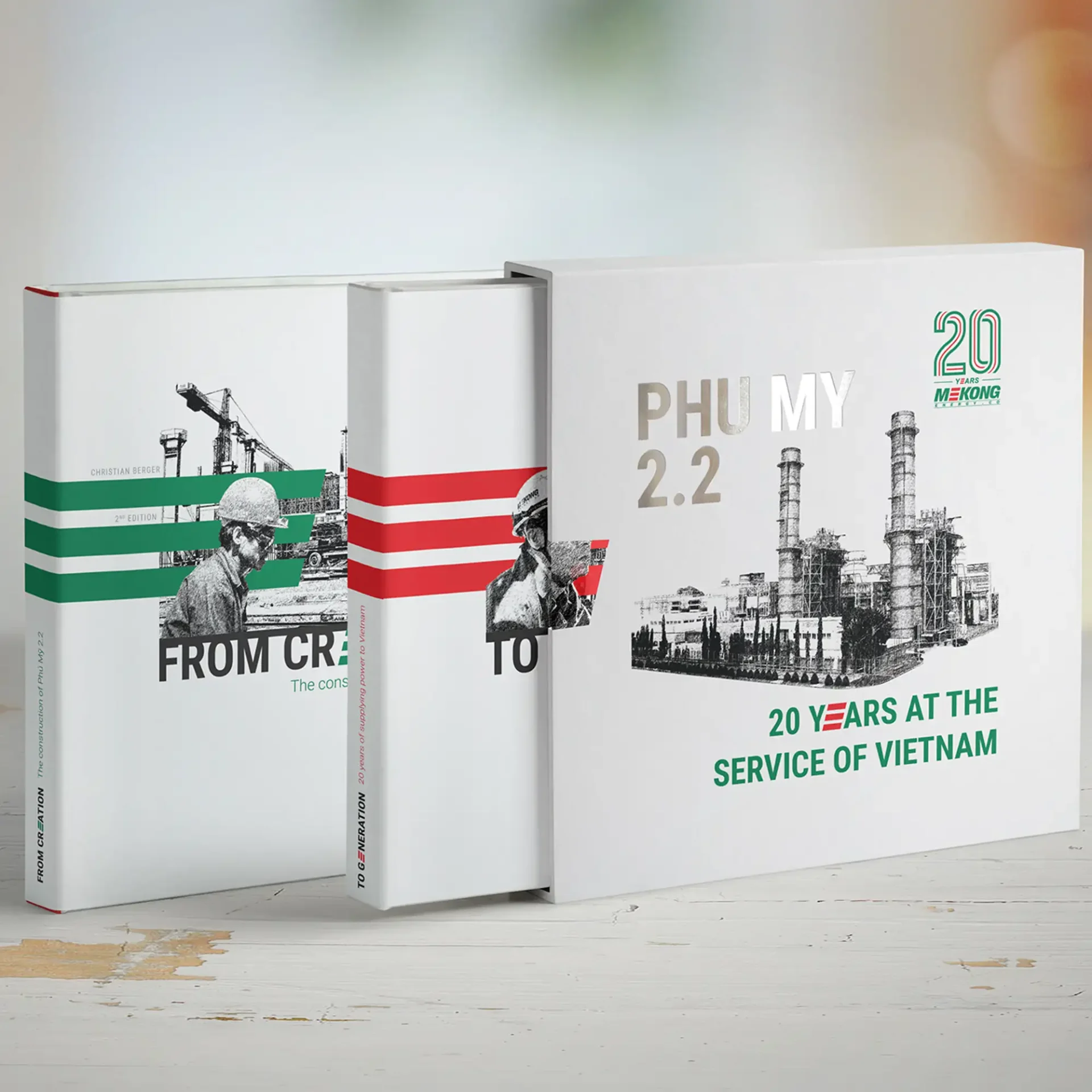
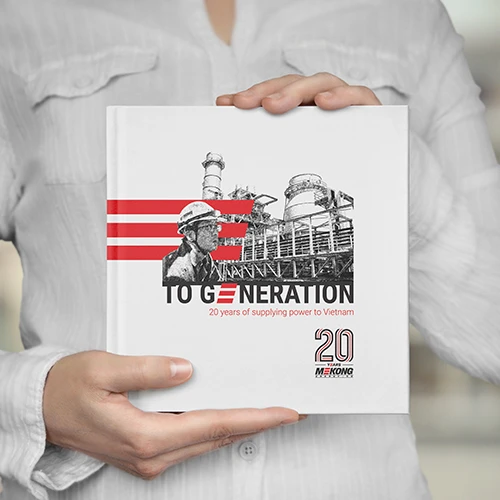
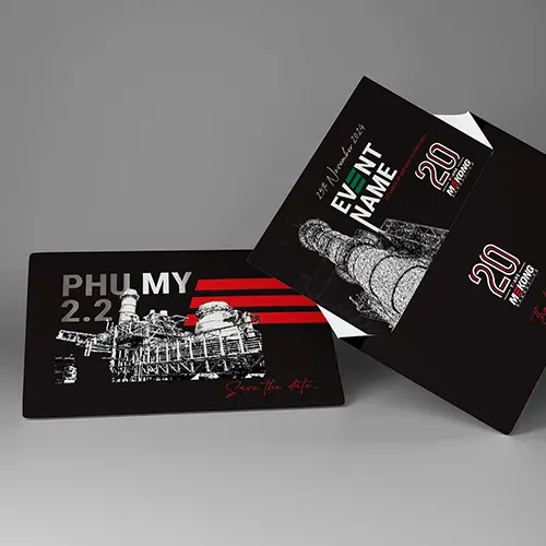
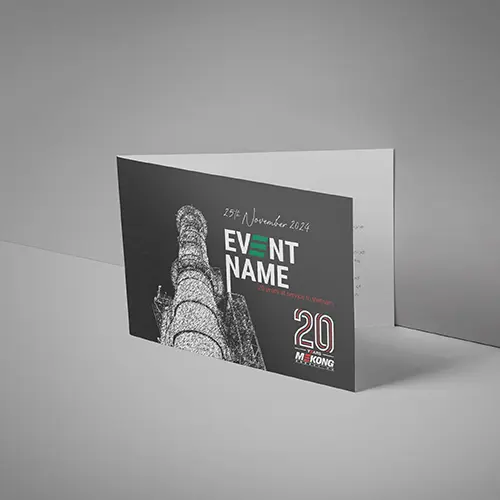
A “Legacy” Book to Trace the Adventure
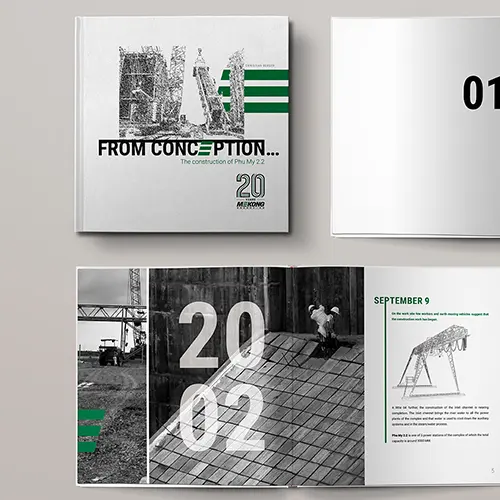
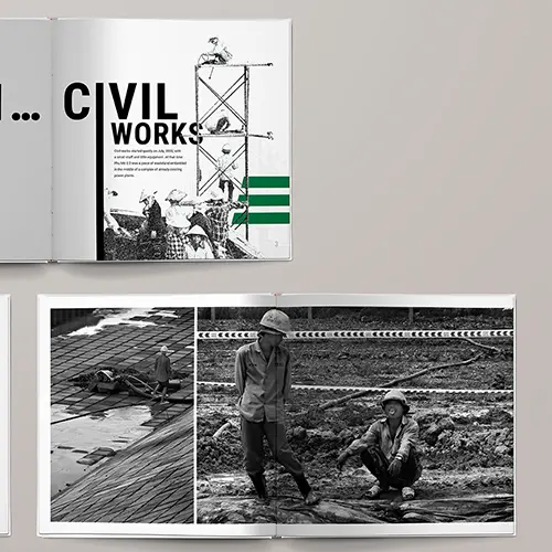
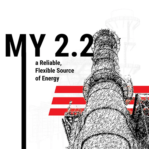
The highlight of this project: the creation of a commemorative book which documents the history of Mekong Energy, from the initial construction sites to the record reliability of the Phú Mỹ 2.2 plant. This “legacy book” highlights:
- Key Milestones : Key dates, construction site anecdotes, decisive moments in the deployment of technology.
- Men and Women : Portraits of those who built the success of Mekong Energy, both on a technical and social level.
- Core Values : Health and safety, technical excellence, social responsibility — at the heart of how the company operates.
Throughout the pages, archive photos and testimonials reflect the teams' passion for producing safe and sustainable energy, as well as the strength of the links forged with Vietnam.
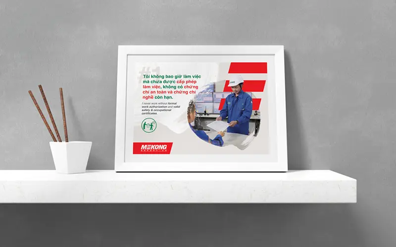
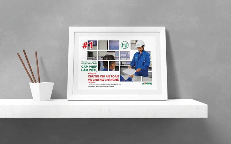
Safety Posters to Reduce Work Accidents
In line with our industrial communication mission, we have also designed safety posters for Mekong Energy.
Their objective: recall good practices, encourage vigilance within the factory and, above all, reduce the rate of work accidents.
By using striking visuals and clear messages (in Vietnamese and English), these posters are part of Mekong Energy's continuous improvement approach, where health and safety remain top priorities.
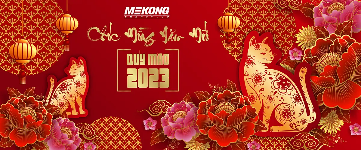
New Year Communication: A Festive Animation on the Big Screen
To mark the Lunar New Year, Mekong Energy wanted to broadcast a festive and warm message on a giant screen during its event. We then designed a visual creation mixing traditional symbols (lanterns, flowers, astrological signs) and the colorful universe of the company. This composition celebrates the new era under the sign of the cat, while preserving the industrial identity and the color palette specific to Mekong Energy.
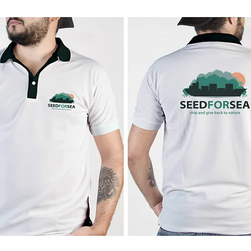
Website Design and Development for the SeedforSea Initiative
To reflect the scale of the SeedforSea project and its ecological impact, we opted for a web design that is both clean and dynamic, favoring fluid navigation and visuals evocative of the mangrove. Natural colors and explicit icons help to convey key messages (reforestation, carbon footprint reduction, involvement of supply chain actors) in an immediate and accessible way.
On the technical side, we focused on clarity of content and responsive design adapted to all media, in order to reach a wide audience (from transport multinationals to local communities).
The site architecture was designed to intuitively guide the user to essential information — project objectives, compensation system, certifications, testimonials — and encourage them to get involved.
With this balance between aesthetics and ergonomics, SeedforSea offers a compelling online experience that effectively supports Gemalink International Port’s mission.
Logo Creation: From Moodboard Phase to Final Proposals
Even before laying down the first sketch, we started with an in-depth research of the visual and semantic elements likely to symbolize the SeedforSea initiative.
Through moodboards inspired by the marine world, mangrove reforestation and supply chain issues, we identified the most relevant graphic ideas: a color palette evoking nature and the ocean, shapes reminiscent of growth (young shoots, waves, etc.) and modern typography, reflecting the idea of a platform looking to the future.
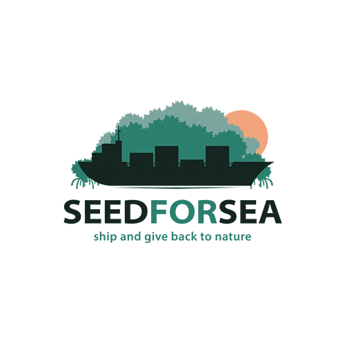

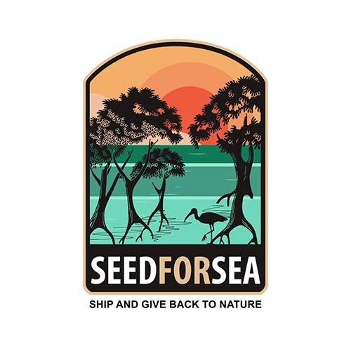

Once the guidelines were validated, we produced several logo proposals, playing on different associations of colors, shapes and symbols. Some versions integrated more “blue” elements (water, drops), others highlighted the earth or plant growth. At each stage, we refined the design to keep only what served the clarity of the message: the protection of the coasts and the active participation of transport and logistics players.
The final logo, the result of constructive back-and-forth discussions, reflects both the ecological dimension of SeedforSea and its roots in the international maritime community.