Smiling man pointing

What is Copywriting?

Defining Copywriting

If you had to talk to customers individually to persuade them
The power to use the written word to persuade someone to take action
Closing in print. The ability to persuade, influence and engage.

Imagine if writing didn't exist. Imagine that, as a brand owner or manager, you had to speak individually to every prospect, customer, partner and passer-by. That means you'd have to tell them your brand name, your sales pitch, and so on. But not only that, you'd also have to fight for attention (even more than you do now). That would mean a lot of effort, time and saliva.

But of course, writing exists. It was invented a long time ago, in 3200 BC. Since then, we could say that copywriting was born. Especially if you consider the following definition of copywriting: The ability to use the written word to persuade someone to take an action.

But wouldn't you say that's the case with all writing?

Copywriting went through many stages before becoming what it is today. Starting with the cuneiforms engraved on stone, which looked something like this:

Up to our alphabet displayed on this:

A more commercial perception of copywriting might be more suited to your understanding: the ability to persuade, influence and close sales through writing.

For your visualisation, imagine if the man in the vignette on this blog was a text.

Why is copywriting important?

Sales and Brand Image

Copywriting is important for sales, of course. Because the writing you put out on your communication channels will become your voice. But beyond this sales-oriented objective, there's another that must not be overlooked, and that's copywriting. is the branding aspect. Copywriting serves your branding because it is your constant and eternal spokesperson for your company.

Like any spokesperson you hire, he or she has to match who your company is and what it's trying to achieve: the way he or she presents himself or herself, the way he or she dresses, but above all, the way he or she speaks. In copywriting, if words are the "what" of the subject, tone is the "how".

When you decided to create a brand, you had an idea of certain keywords you wanted to associate with it. These keywords are then conveyed through all your communication channels as part of your marketing plan. Copywriting is not outside the scope of marketing. And the way in which the content is written must convey these keywords.

This is done in a number of ways, such as word choice, phrasing, choice of pronouns and the type of content itself.

Different Voice Tones

Perhaps you're not sure how a tone of voice is defined or how your brand is represented through it. One obvious way to find out is to check how your customers talk. After all, they're the ones who will read your content and act on it. But they'll feel closer to an organisation that understands them AND has their best interests at heart with an offer to solve a problem they have.

Here is a spectrum of the different tones your company can adopt:

  • Concise / Discursive
  • Detached / Warm
  • Professional / Casual
  • Serious / Fun
  • Formal / Informal

You could look at that spectrum of tones and say something like "I don't really need a tone because I sell to other companies". I get it.

A tone is a polarising thing to some extent and not something you want when working with other organisations. However, I would argue that it is a good thing.

If your content is corporate and bland without any personality, it will only be a few seconds before your reader clicks the back button. Your brand can be many things, but it can't be boring. To think that this doesn't apply to B2B communication is simply not true because we are all humans communicating with each other.

I would even add that we are 21st century humans with a high intolerance for anything boring. So leaving no impression on your audience is the worst thing that can happen to you. Conversely, if someone hates your tone, that's great - it means they'll probably like it.

This is where the commercial definition of copywriting is limited. In a way, it excludes the more psychological approach that exists between the copywriting of your brand and your target.

Here is a more modern definition of the discipline: The written words of your business concept and marketing strategy.

How to do Copywriting?

We want words to boost sales, create good branding and move your target to action.

Brilliant!

But first we have to listen.

We'll want to know about you, your organisation, what you do and the essence of what makes your customers tick. It may seem pointless, but if we can understand who you are, it will be easy to create cutting-edge content and make your target care about what you have to offer.

Sales haven't really changed, but the way we make sales has, here's how:

🚫 Past are the days where a buyer would come on a website for the first time and make a purchase.
🚫 Gone are the days when product-centric speeches closed the deal.
🚫 Gone are the days when aggressive selling and intrusiveness made people buy.

Our customers have matured, they know all the sales tricks.

It gets worse. They may feel they are being led and may push you away. This can prove fatal. Because today, they have access to countless other offers at their fingertips thanks to the power of the internet. If your target's behaviour changes, you have to change with them.

Successful sales today are made by self-persuasion rather than direct persuasion.

Sales copy doesn't make for memorable content. It's either unappealing or boring, and that means that over time your business loses or fails to gain trust and authority.

Here's what good copywriting does:

1 - It makes money.

Just because sales have changed doesn't mean it's become anything different. At the end of the day, good copywriting converts, always. Professional services have a 10% conversion rate, while e-commerce sites have a 3% conversion rate. Copywriting on a landing page can add 2% to these figures. In other words, it can increase sales by 50%.

  • Conversion rate of 1%: you need a copywriter.
  • Up to 3%: not bad.
  • From 3 to 5%: you have skills.
  • From 5% upwards: you have hired a professional.

2 - He is honest and clear

Not telling the truth to sell is a bad idea. Respectable companies know this. However, many companies are guilty of using ambiguous language. All businesses have their shortcomings. It can be tempting to hide them with deliberately ambiguous and obscure language, or with tortuous and misleading wording. This does not work.

Clear, understandable content is more pleasant to read because it flows naturally for the reader. If your text is easy to read, then your audience will get the impression that your offer is easy to buy.

3- It's interesting

As mentioned above, with the changing behaviour of consumers around the world, companies need to change the way they communicate. Today, the road to sales is paved with good content.

Good content can take many forms, but let me tell you that if you think it's about your brand and your product, you're probably wrong. You need to think about your customers:

✅ What do they want when they search for things on their browser?
✅ What information related to your industry would they like to acquire?

Use your website as a direct sales tool, but don't give the impression that's what it's for. Because the internet is first and foremost a means of obtaining information and your company should jump at the chance to give it to them. By doing so, you will become a reference in your target's mind. They'll remember you and come back for more... and probably buy from you when the time comes.

In turn this will increase sales, boost your traffic, give you backlinks and give you better ranking on search engines which will in turn drive even more traffic to your website and increase sales. 🔃

So how do you make good content?

Key Ingredients :

  • Good Writing : Grammar and all.
  • Combined Design and Marketing : The writing can be great but if it looks ugly on the page and no one can find it then it might as well not exist at all. Make sure your pages look good.
  • Highlighting Value The message will have a more lasting impact if it is based on the value provided by the product or service.
  • Getting specific Back up what is said with statistics. Numbers speak louder than words.
  • Making it personal People (usually) read alone, it makes it more natural to write in that matter.
  • Appropriate tone of voice We speak the language of our audience to be understood.

By following these principles, you can create compelling and effective copywriting that stimulates engagement, builds your brand and increases sales.

Don't hesitate to contact us for a free audit of your business - we're here to transform your communications and maximise your impact!

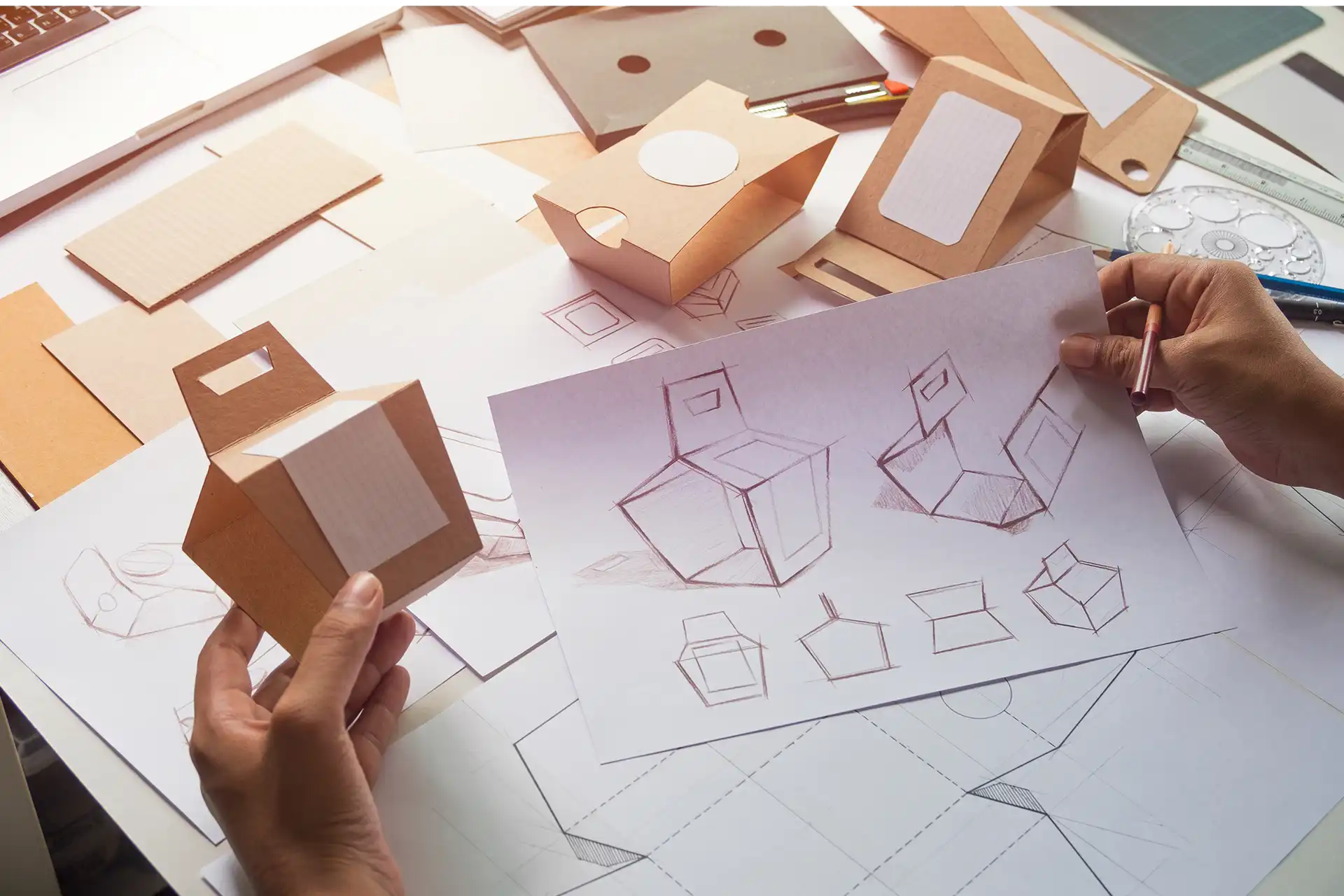
Packaging prototype design

Packaging 2.0

Packaging: your communication trump card!

As you will no doubt have noticed, with the growth of ecological issues, the trend today is towards bulk packaging. Although these new concerns and consumer habits should not be overlooked, traditional packaging remains essential in many cases, whether for technical or commercial reasons.  

The role and functions of packaging

For some people, packaging only exists to look pretty. However, most of the time its primary function is a technical one: whether to contain a liquid, protect a fragile product, help preserve a foodstuff, enable or facilitate its use by the consumer (as is the case with the famous Flanby tab, or the Pom'Potes propeller caps that make it easier for children to open their water bottles)...

The pack also has commercial and marketing functions. Although secondary, these are the ones that require the most strategic thinking, because packaging is your primary communication tool (the one you can't do without because of its technical functions, and which is therefore in a sense "free") and it allows you to convey a considerable amount of information. In my opinion, this is the most important role from the brand's point of view, especially in supermarkets where your customers don't get buying advice and where competition is fierce. In this case, a well-constructed pack can make all the difference!

Your packaging will enable you to convey different messages such as :

✔️ Identify your brand name, image and positioning. 
✔️ Communicate your strategy.
✔️ Information your consumer on the product itself, its composition and its use.
✔️ AttractThis can be achieved by making your product stand out from the competition and/or by creating a specific appeal and emotion for the consumer. Packaging with sufficient impact will be a real vector for your brand image and will help to improve your reputation.

Source : aesop.com

Source : aesop.com

For example, the Aésop pack, although extremely sober, conveys the brand's key messages:

✔️ The brand name: the first visible piece of information that stands out from the rest
✔️ The transparency strategy is clearly displayed by putting the list of ingredients on the front of the product, whereas this information is usually on the back.
✔️ The use of black and white conveys both the simplicity of the brand and its slightly premium positioning.

How can you ensure you develop striking packaging?

As a brand, you will mainly have to manage the key stages of thinking about and designing the graphic chain during the development of the pack, but you will also have to manage the document control stages during the printing phase. It's a bit tedious, but you shouldn't neglect it, because you're the one who knows your pack best, so you'll be in the best position to spot any potential mistakes. And above all, if there's a problem with the final result, you'll be the one who suffers!

Draw up an exhaustive brief to guide the graphic design process

This involves thinking about the strategy that your pack should convey and centralising everything in a set of specifications to guide your graphic designer in its design. In our experience, we often try to move as quickly as possible on the graphics, but without having validated (at least in part) the format of your pack, there's not much point in starting to think about it in depth. The layout and quantity of information will depend very much on the medium: its shape, the surface area available, etc. I therefore recommend that you start by looking at the broad outlines of the format before tackling the design brief in detail.

Define the functional brief to determine which format and materials to opt for

Here is the list of questions I systematically ask myself to refine my brief:

  • What should my pack contain?
  • What technical functions should my pack fulfil?
  • What are my technical constraints in terms of storage, transport, the production line, shelving, etc.?
  • What is the maximum unit cost I want to invest?
  • What material(s) do I want to use (depending on cost and brand positioning)? For example, in the spirits sector, you may have several options: just the bottle for an entry-level product, the bottle in a cardboard case for a mid-range product, or the bottle in a canister (more solid) for a premium positioning.
  • How many colours (including Pantone colours) can/should I use? If you can, use a Pantone colour for your logo to ensure consistency between your different printed materials.

You should also consider the ecological aspect at this stage. Today, there are a number of aspects you can play with to optimise the durability of your packaging, such as the ink or material used (use less material, a material that is easy to recycle or develop a pack that can be reused).

Here is the list of questions I systematically ask myself to refine my brief:

This is certainly the most important aspect of your thinking. You can opt for a standard pack format and material and rely entirely on the graphics to make you stand out from the crowd. This is often the case for entry-level or mid-range products.

The creative brief will then be interpreted by your graphic designer, which is why it is important to be exhaustive about the content you want to see on your pack and to guide the creative aspect sufficiently to be consistent with your brand image.

Start by listing the written content:
  • Exhaustive list of compulsory and recommended information (regulatory information, information relating to quality, etc.) + specify the position they must occupy if this is required by law. Remember to define these items clearly first, as they will limit the space available for optional items.
  • Name of your brand and product, and logo
  • Advice on using and preparing the product...
  • Marketing information to tell your story and create a link with the consumer, and any other information you wish to pass on, such as promotional offers, the rest of your range, etc.
Give your graphic designer something to work with:
  • Complete graphic charter to be attached to the brief
  • Explanation of the context to enable the graphic designer to understand what is at stake: your target and positioning, the reason for the project (new product, facelift, etc.).
  • Benchmark competitor packaging to understand the competitive landscape and how to stand out from the crowd.
  • If you already have existing products, attach visuals of the packs so that from the outset you can create the harmony and homogeneity that are essential to the brand image, but also provide enough differentiation to clearly understand the construction of your offer.
  • If your market and positioning dictate it: the codes to respect. For example, on products such as infant formula, there is a real need to reassure the buyer. So it's essential to respect market codes.
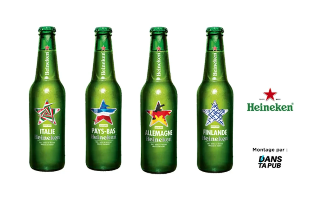
  • On the other hand, if you are making a limited edition, if your product is not very engaging or if your brand already has a good reputation, you can allow yourself to deviate from the usual codes, for example Heineken's limited editions for the Euro football tournament, where the brand name is minimised in favour of the participating countries.

Source : Danstapub.com

Ensure consistency between brief and graphic expression

Throughout the graphic design process, keep your brief in mind: all the elements mentioned in it must appear on the pack. You should also take the time to make a mock-up so that you can see how it will look in 3D at actual size, so that you can judge whether the various elements are visible and legible when facing (you can only see this sort of thing at actual size) and so that you can test the design in a real-life situation by positioning it:

  • With the rest of your products to ensure both consistency, so that the consumer makes the link between the different products in your brand, and differentiation, so that they understand that these are different products or even ranges.
  • Talk to competing packs to make sure your pack stands out.

Only once all these points have been validated (and you are happy with the design) can you send the file to the printer.

What should you check once your file is in the printer's hands?

Control #1 : Once your file has been adapted by the printer (essential if it is to run on technical machines), remember to check :

#2 control : The proof! This is when you validate the colours in your pack by means of a document called a colour output, cromalin or colour proof. For a very strategic project or if you're working with a new printer, I recommend that you go on site for this stage. It will be easier for you to ask for any necessary adjustments. Don't hesitate to take advantage of the proof to check the text and images again, because a validated proof serves as a control base for your printer for the rest of the production.

Control #3 : A final check on receipt of the first production runs, to ensure that everything conforms to the proof, especially if it's a reprint.

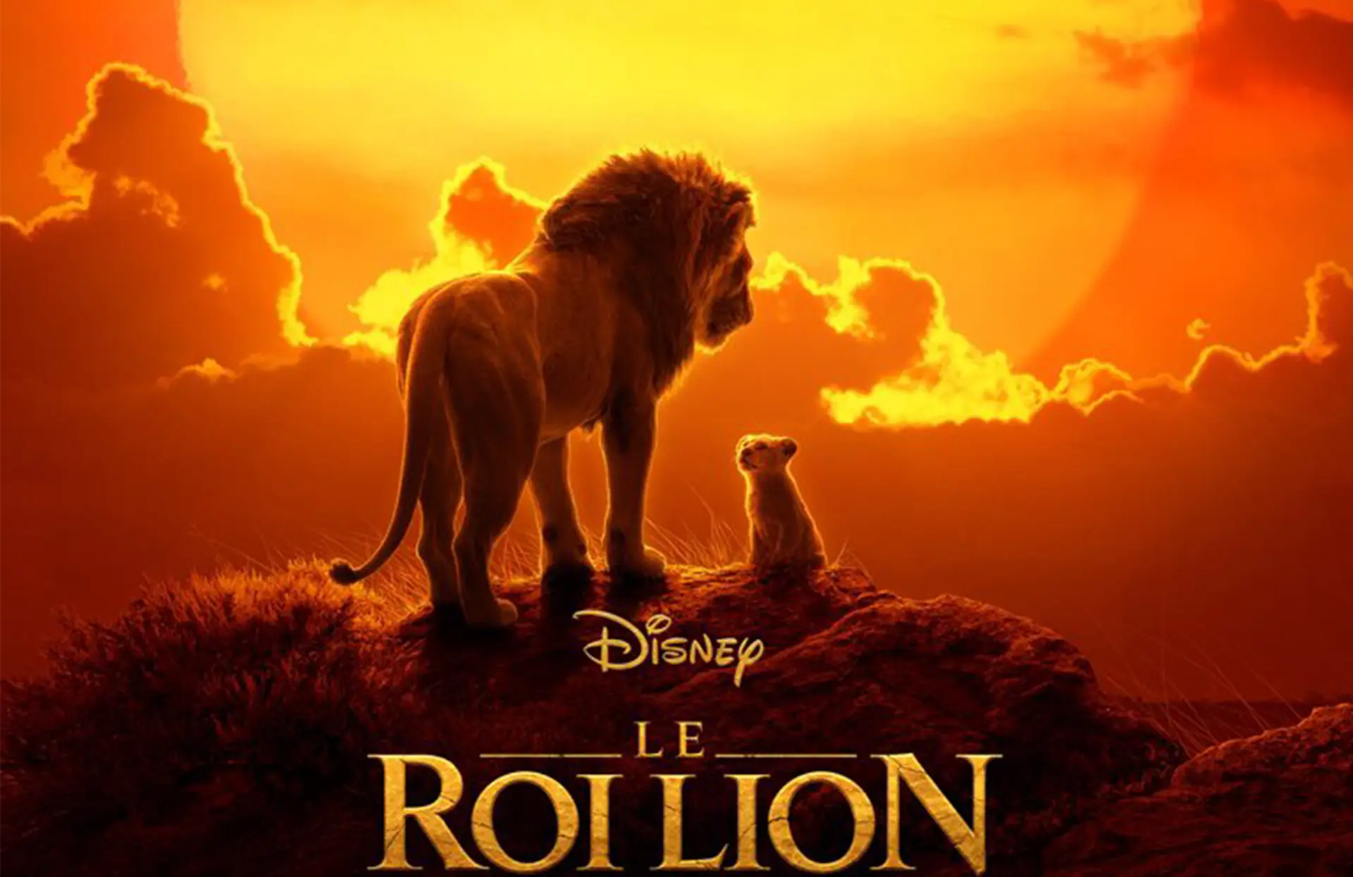
King Lion movie 2019

ANIMATED FILM, LIVE-ACTION OR MOTION CAPTURE?

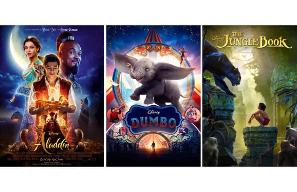
In recent years, the great classics 2019 version of Disney have amazed us: “Dumbo” by Tim Burton, “Aladdin” still available in certain cinemas or even “The Jungle Book” a digital feat.

Here's how Disney decided to renew its image: rework all these great animated classics into films made on computers.

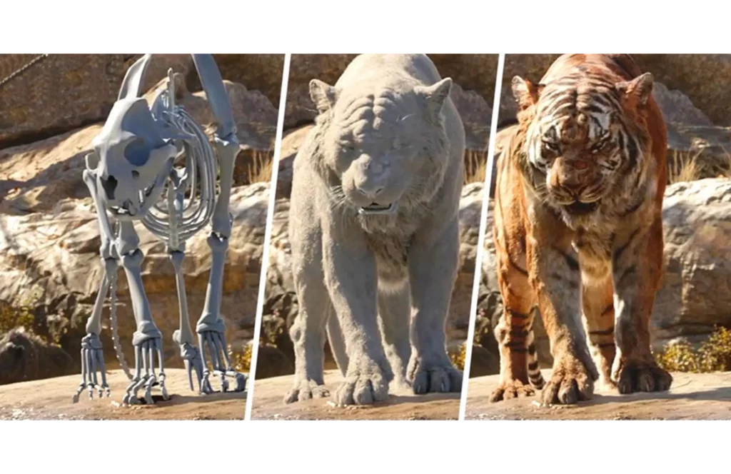
The distinction between animated film, live action or motion capture is becoming more and more precise. Neel Sethi was for example the only real actor in The Jungle Book, he interacted with animals made entirely of computer-generated images.

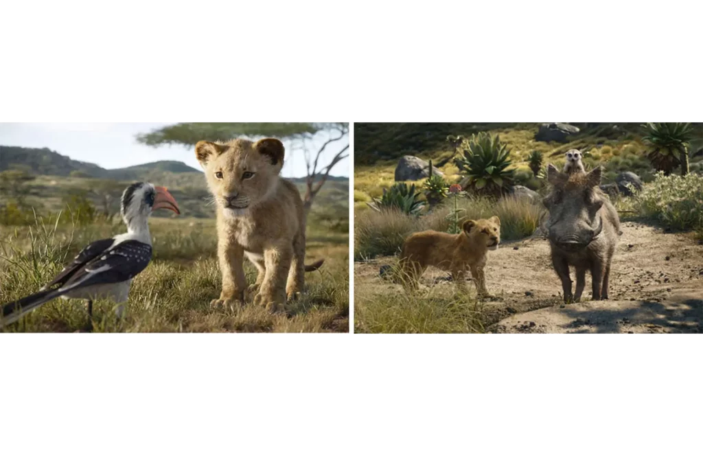
But it is with The Lion King that Fairview Entertainment studios once again push the limits by offering a film created entirely on a computer and hyper realistic.

During an interview Jon Favreau, chief producer of The Lion King himself admitted to not knowing whether it was an animated film or a "live action", he even added that it was not of neither. He wanted to offer us images worthy of a BBC animal report and which in no way resemble visual effects made on computers even if the animals speak and behave humanly. The trailer available here:

No scene in the film was filmed in real life. Jon Favreau scouted Kenya, Africa, collecting images of natural landscapes so that they could serve as a source of artistic inspiration. Once in the box, these live shots were undoubtedly digitally retouched, in order to match the graphic style of the rest of the scenes. But be careful, this is not “performance capture” or “motion capture” either.

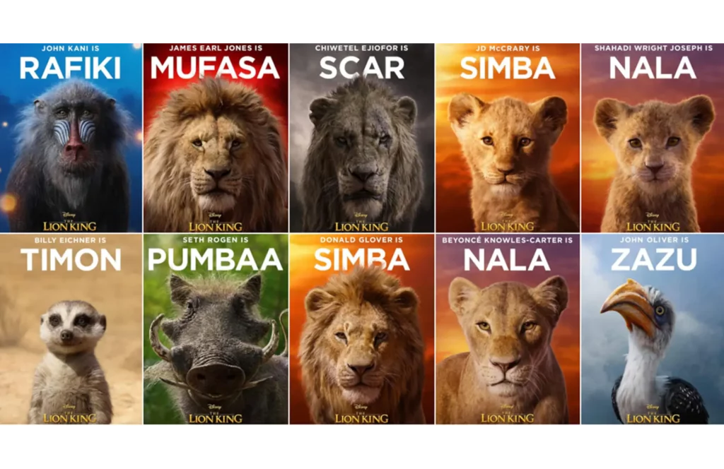
In fact, the actors and artists recruited only lent their voices: James Earl Jones plays Mufasa, Donald Glover is Simba, Beyoncé Knowles, Nala… A great casting which adds to the impatience of the fans. In addition, no animals were actually filmed, the artistic and design team only took inspiration from nature to make the animals seem as real as possible. Some behind the scenes images available here, English subtitles available:

So we were impatiently waiting for July 19 to finally be able to appreciate the results of all the efforts of the design teams! In the meantime, we offer you 3 new facts about the cartoon from our childhood:

  1. The Lion King was originally going to be called "The King of the Jungle" until the team realised that lions don't live in the jungle...
  2. Simba, Sarabi, Rafiki and Pumbaa are Swahili words. They mean lion, mirage, friend and stupid.
  3. For the scene involving Scar and the hyenas, Disney took inspiration from Nazi photos. Who would have thought!

And you, do you have anything new about The Lion King? Write us all about it in the comments.

Creating your brand logo

Hello readers!

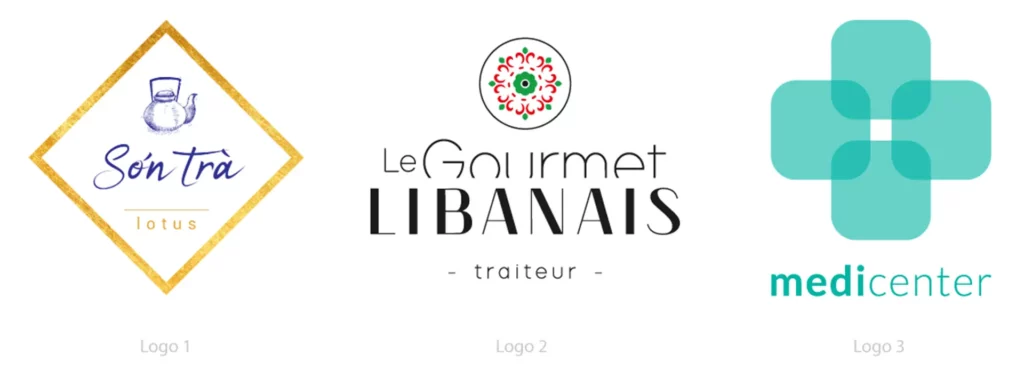
Today I reveal to you all the secrets of making a logo. This is a mission of the highest precision and the end result must be perfect! This is why all aspects must be thought through beforehand. Going through the choice of colors, shapes and the desired emotion. We will end with a podcast on this subject. Sophie Bodineau, founder and graphic designer for What'zhat design Agency, will analyze 3 logos for us.

Now to the real subject.

THE MEANING OF COLOURS

Color is what is noticed first, it will be connected to your brand and visible on all your communication media.

Each color has a meaning, an unconscious connection in the minds of people (especially in Western countries). This is why it is very important to think about the keywords for your business.

– Red represents paradoxes, love/anger, bravery/danger, zeal/prohibition

– Green represents renewal, growth, hope, nature and luck

– Yellow represents light, ego, knowledge, friendship and joy

– Blue represents security, stability, loyalty, wisdom, trust and science

– Pink represents tenderness, romance, femininity and beauty

– Orange represents communication, dynamism, enthusiasm and fun

– Black represents power, mystery, elegance, simplicity and rigor

Attention ! Each psychological association about colors can quickly change depending on cultures, current events, years, personal history and trends.

For more information, please visit these websites: code-couleur.com and Pantone.

THE MEANING OF SHAPES

If you use shapes in your logo (sometimes brands only use typography) this will have an impact on the perception of your brand's values and identity. To reach your target you must know how to recognize the brain's unconscious associations about certain shapes.

Here are the most common and what they mean to most people:

– Rounded shapes: welcoming, warm

– Square and rectangular shapes: serious, stable and balanced

– Triangular shapes: power, hard

– Organic shapes: flexibility, natural

– Spiral shapes: introspective, inspiring and continuous

– Vertical lines: hierarchy, superior and strong

– Horizontal lines: communication, calm and serene

The advice is to use shapes sparingly, overdoing them can make understanding difficult. A good logo is clear and readable. You can also create shapes without actually adding them using the positive/negative shapes technique, some examples here.

AN INTELLIGENT MIX

For a logo, anything is possible, any shapes and colors, however a graphic designer will always keep in mind the main message of the company and its key words. This often results in a coherent mixture. In the event that your client absolutely wants a triangle, with sharp angles, while he sells supplies intended for newborns, it is possible to soften everything by adding a very light blue for example. It's all a question of balance.

THE PODCAST

As promised, here's a podcast on the theory of choosing colours and shapes.

Plus, the analysis of 3 logos, above, created by the What'zhat team (in French):

WHAT DO THE DIFFERENT TYPEFACES MEAN?

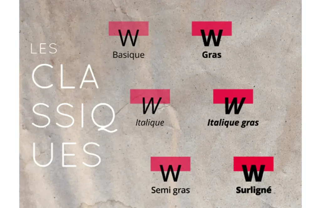
As Wikipedia says, typography refers to the various typesetting and printing processes using raised characters and shapes, as well as the art of using different types of characters to make language legible, attractive and intelligible.. In fact, these are 3 of the main factors we take into account during our meetings with our customers.

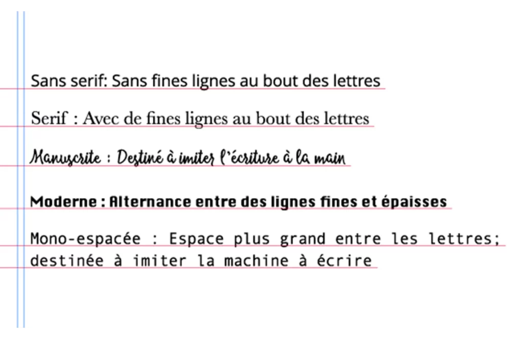
First of all, this image will help you understand the differences between typefaces:

However, I can assure you that you don't need to know all these technical words in detail - I know you don't have the time! So I suggest you read on, which focuses more on the psychological aspect of each typeface.

Each font does not pair with any other. Having a good combination will allow you to create depth in your identity (this rule also applies to all your presentation materials and designs, thank me later for the tip). You will find right there, a link to a very good site which will save you from errors of taste. You will also need this website which lets you download your favourite typefaces.

THE IMPORTANCE OF EMOTIONS

After choosing your colors, shapes and typography you will start to get a good first vision of your future logo. However, if you stop here you'll probably miss the best part: the emotions. Nowadays we no longer buy products the way we used to. Customers are looking (unconsciously) for a relationship with the brand. They no longer buy the product only for its characteristics but also for what the brand represents and conveys.

That's why you need to concentrate all the more on your logo. Try to play on one of the 6 emotions recognised by specialists as the strongest: joy, pride, confidence, curiosity, fear and guilt.

For example:

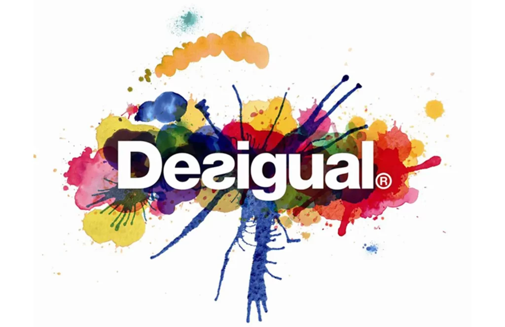
Desigual, a leading ready-to-wear brand, has created a logo that we believe represents many of these emotions very well. Thanks to the very organic shapes that seem to form an explosion of colours, Desigual hopes to arouse the curiosity of its customers. The clarity of these same colours is an obvious invitation to a feeling of joy and celebration.

Finally, the typography, which reverses at times, shows that Desigual doesn't hesitate to go against the grain and impose its sense of pride with a very bold typeface. In this excellent example, we can see that all these elements form a coherent whole that is entirely in keeping with the brand.

YOUR LOGO IS FINISHED!

Now is the time to enjoy your logo and display it everywhere. But remember that time flies! You need to be flexible when faced with a constantly changing environment. As explained above, the meaning of colors, shapes and typos can change overnight depending on events. Don’t hesitate to change or modernize your logo when you feel it’s time. Don't be nervous! Your customers will be surprised in a good way and will talk about you during the coffee break! It is good and positive for them to see that your business is evolving and following trends. Evolve your logo intelligently, follow your strategy already in place and stay in line with your brand image and your values.

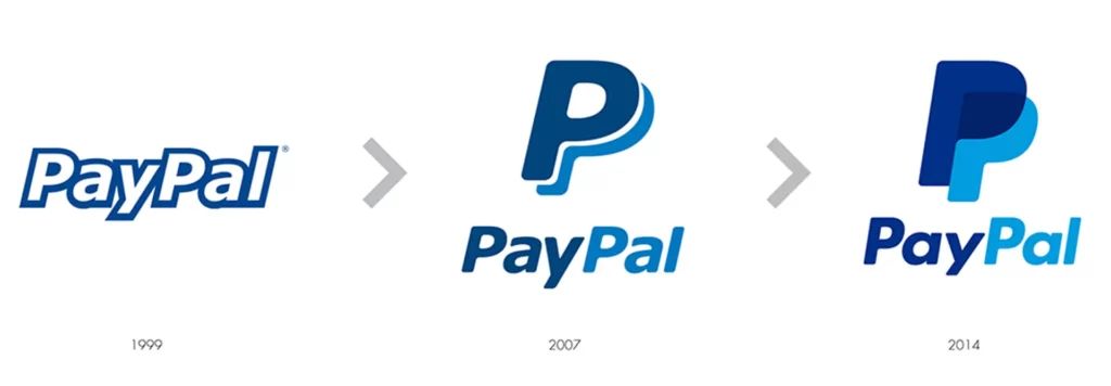
For example:

Paypal, which offers online payment methods, has not only evolved its logo in line with its environment and current trends, but also in line with its own history. Back in 1999, very few people were using this service. The Internet was only two years old, so as the company has grown in importance, it has also become more confident in its approach to its logo, with fuller letters, brighter colours and an overall look more suited to a leading company.

Back to the blog

New product development process

Product development : What are the key stages?

Designing a new product is good, but designing it well is even better! That's why taking the time to design your new product is essential if you are to offer your potential customers the most relevant product for a successful launch.

The importance of getting to know your customer

First of all, let's talk persona.

The persona is the representation of your ideal customer. In any marketing approach, it's important to keep this persona in mind in order to remain relevant, save you time and, above all, guide you in your future actions, whether it's product development, content creation, choice of communication media, etc. But why be so customer-focused? Quite simply because the customer is your reason for existing: without a good customer, there can be no business, and marketing is certainly sometimes a little intuitive, but above all it's about addressing your customer in a convincing but fair way. So taking a little time to get to know each other doesn't seem completely pointless!

Defining your persona involves creating a typical character by drawing up a sort of identity card (what is their age? their gender? where do they live? what is their family situation?), but above all by identifying their lifestyle as precisely as possible. To do this, you need to be able to answer the following questions:

✔️ What type of job does he/she do? What is their socio-professional category?
✔️ What are their habits? What is his lifestyle?
✔️ What are their beliefs? Their values?
✔️ What media do they use for information and entertainment?
... and any other point related to your sector of activity that you consider relevant.

Some sites can help you build your persona and also provide file templates to keep this information safe: XtensioHubspot or even WeLoveUsers.

The development process in 4 stages

Product development can come about either because you need to expand your offering or because you see an opportunity that you don't want to miss. In both cases - apart from the idea generation stage - the development process will be much the same.

1. Generate ideas, then skim them

It can take a long time to come up with a relevant idea for a new offer, so it's best to work on this stage before you even need it.

👉 Stay on standby all the time

The best way to generate new ideas is to keep a daily watch on both your business sector and related sectors: follow what your direct and indirect competitors are doing, monitor developments and trends in your market both at home and abroad, keep abreast of advances and new developments in technology, the environment, politics, etc. As well as helping you to come up with new ideas, this is how you will gain a better understanding of your market.

👉 Analyse what your consumers are saying

As always, we think in terms of customers and consumers, and we include them directly in the loop because it is they who will tell you the most about their expectations and needs. Read the messages they send you carefully, but above all take a look at the forums and pay attention to the comments they make on social networks, because that's where their remarks will be the most sincere and free.

👉 Brainstorm as a team

Talk to your colleagues and friends to share your ideas and exchange views, both to help you generate as many ideas as possible but also to sort them out and keep only a short list.

Skimming should enable you to concentrate only on ideas with a certain potential. To do this, analyse these ideas according to various criteria:

✔️ The desirability of your idea for your persona
✔️ Its market potential: how mature is the market? Is it flooded (if so, it will be harder to get a foothold)?
✔️ The relevance of the idea for your company (complements your current offering? in line with your DNA?...)
✔️ Its feasibility, whether for legal or technical reasons, for example. If your idea involves entering a new market, be sure to study its key success factors to find out whether you have all the knowledge and skills required in-house, or whether you will need to recruit or subcontract.

This is a very important step, because if it's done properly, you'll be able to concentrate solely on ideas that are potentially interesting to your customers, and therefore avoid investing unnecessary time and money.

2. Turn your ideas into concepts

Once you have identified the ideas that are most relevant to your business, you will need to refine, detail and structure them into a customer benefit (also known as a value proposition) in order to move from the simple idea stage to that of a product concept.

How do you identify and define a good value proposition?

The value proposition is the materialisation of a unique solution that you offer in response to a frustration identified in your persona. In other words, it's the answer to the following questions: what problem am I trying to solve (= the frustration)? how is my product going to provide something unique, something new? what concrete result is it going to achieve? Your value proposition can cover a number of different aspects: performance, sensory identity, technical description/composition of the product, price positioning, distribution.

Although it may seem tedious, taking the time to draw up your value proposition will enable you to know how to stand out from the crowd by differentiating yourself from the competition and therefore help you to know which assets to back up your communication.

At this stage, you will realise that, for various reasons, some ideas will be difficult to transpose into a concept and will therefore be discarded on their own. A second skimming will take place naturally.

However, if several concepts are still in the running, if you need to perfect a concept or even if your concept seems to be complete, it's worth testing it against the reality of the market, because just because you like a concept doesn't mean it will find an audience. So think about involving your current or potential customers right away by asking them about their perception of and interest in the product you are planning to create. You can gather their opinions in any way you like: focus group type studies if you can, approaching them directly in the street, in your shop if you run a boutique, for example, or using online questionnaires or even an Instagram poll. Consulting your friends and family first is also a quick and effective way of taking the temperature.

3. CREATE AND, ABOVE ALL, TEST

Once your concept has been validated, it is time to move on to developing the prototype. In addition to aiming to materialize the concept, this step allows you to verify its technical and financial feasibility. Do not hesitate to develop several versions of the same product to determine the best version, but above all present them to your target consumers so as not to go down the wrong path, even if your prototype is not completely completed. This may allow you to identify possible obstacles and objections that you had not previously identified and to remedy them before large-scale production and thus save time and money!

When it comes to testing your product, a large-scale study is always more interesting, as it will provide you with representative and comprehensive feedback. However, if your financial resources don't allow it, the test options mentioned above are also applicable here and will once again provide you with valuable information.

4. Take the plunge

Finally, once all the stages have been validated, it's time to launch. Of course, you can never be sure of failure, but by taking the time to ask yourself the right questions and to test beforehand, you will have put all the chances on your side for a successful product launch. And don't forget that you will always be able to make improvements at a later stage.