Medical clinic logo

Creating the brand image
Medicenter came to us because they were looking for a modern, simple and human medical image. The challenge for the Medicenter logo was to be trendy, dynamic and retain the traditional health codes. Basically, this meant keeping the blue, the green and the cross. With these requirements in mind, we created a cross made up of turquoise squares with rounded edges, for a modern and simple look. These four squares form the cross, symbolising the link between the different human skills of the medical profession.
Find out how to create a logo, this article will reveal the essential tips.
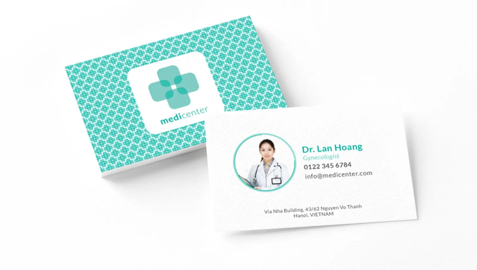
Business cards
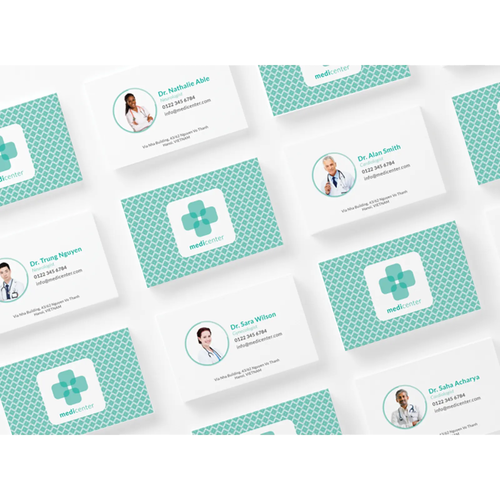
The business cards are connected to the logo style to reinforce their brand image. We used the cross as a motif. It's visually eye-catching and vivid, so the contact is easier to find in a wallet already full of business cards. To continue to give the project a human touch, we decided to add photos of the doctors directly onto the business card. This helps to maintain the feeling of closeness between doctor and customer.
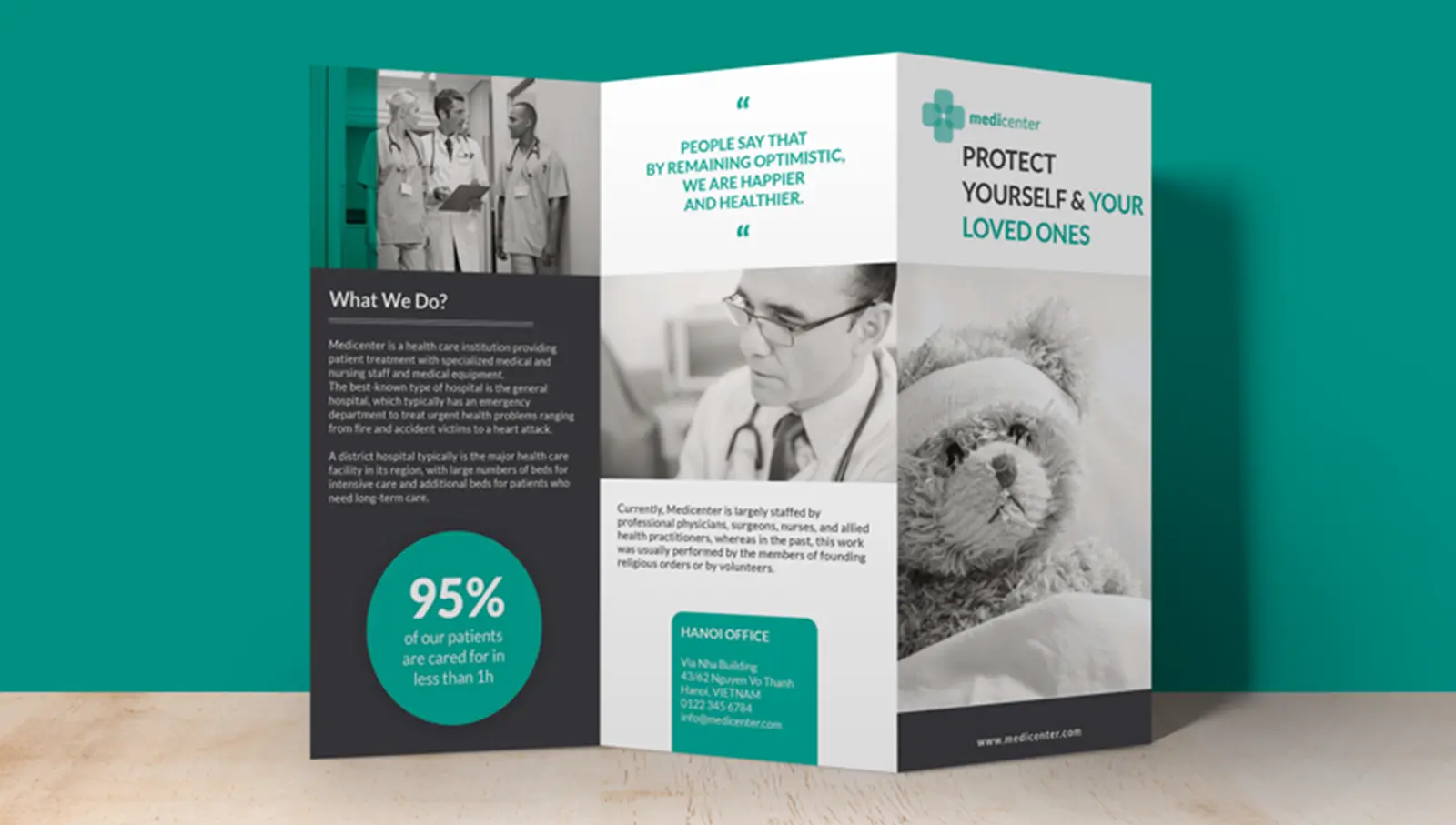
Brochure design
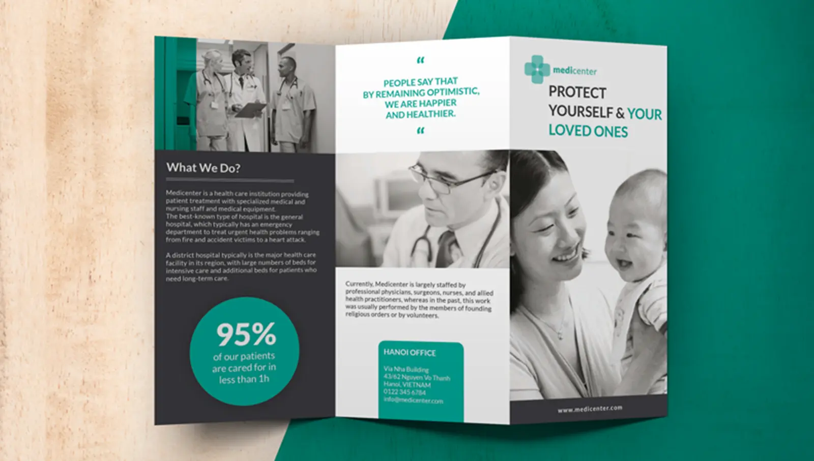
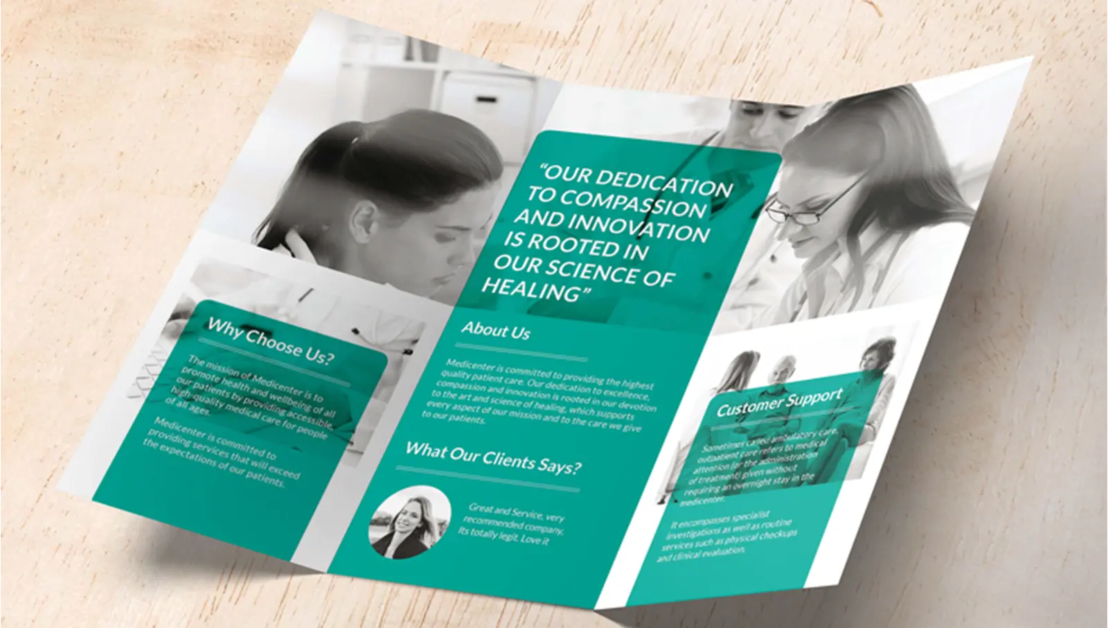
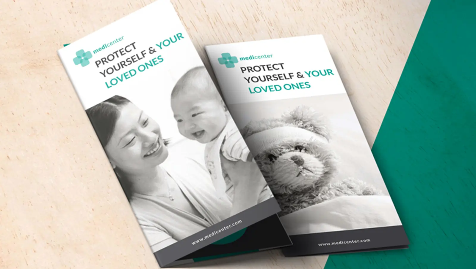
This brochure is available in the lobby and waiting room. The aim of the 3-part leaflet is to reassure the patient and highlight some of Medicenter's skills. To continue to express the close relationship with the customer, we decided to add a large number of photos, quotes from doctors and customer testimonials. This descriptive booklet is an essential marketing tool for any company that receives customers on its premises.