Real Estate flyer design
Design de Flyer Safti Immobilier : Miser sur la Proximité pour une Prospection Efficace
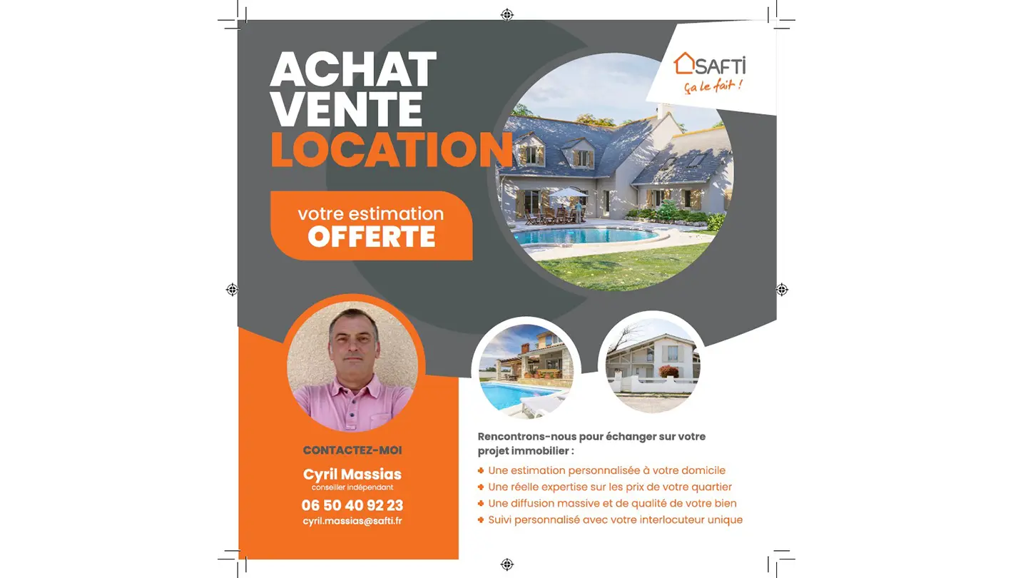
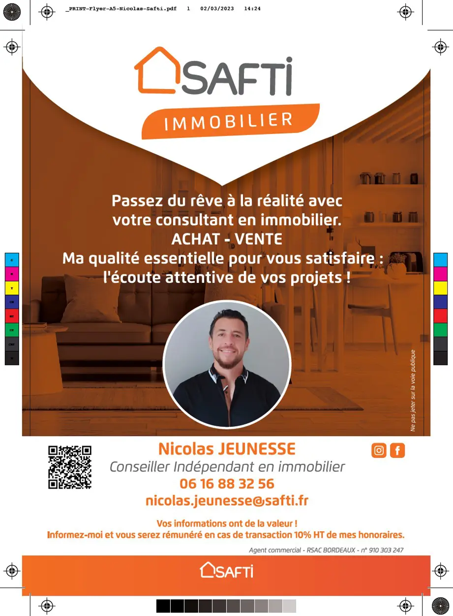
As part of its business development strategy, Safti Immobilier wanted to create a flyer that would be both effective and user-friendly for canvassing through letterboxes. The decision to include a photo of the estate agent on the flyer was based on a desire to emphasise proximity and availability: a recognisable face is more likely to encourage prospects to trust the brand and make initial contact.
A Flyer that Values People and Expertise
The main idea behind flyer design was to highlight Safti Immobilier's expertise, while reinforcing the human aspect through the agent. To achieve this, several key points guided the creation of the site:
- Prioritising information A property flyer should quickly set out the advantages on offer (free estimate, personalised support, etc.) in an order that makes it easy to read.
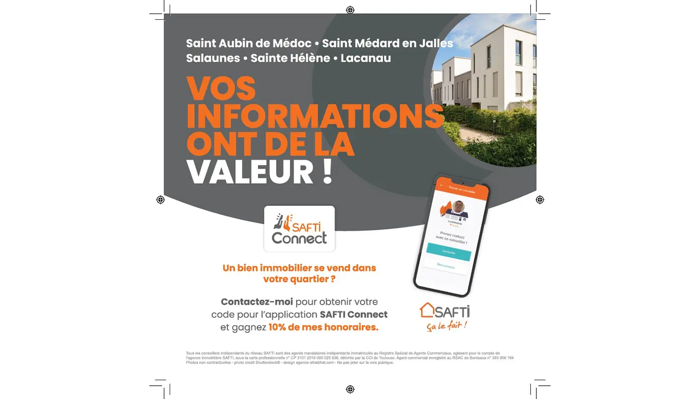
- Clear graphic elements Colours and visuals that evoke confidence and professionalism, in keeping with Safti's brand image.
- Photo Portrait : Placed at the heart of the visual, it reinforces the idea of proximity and humanises the prospecting process.
The Rules of Printing: From Paper to Cutting
Print requires several simple but essential rules:
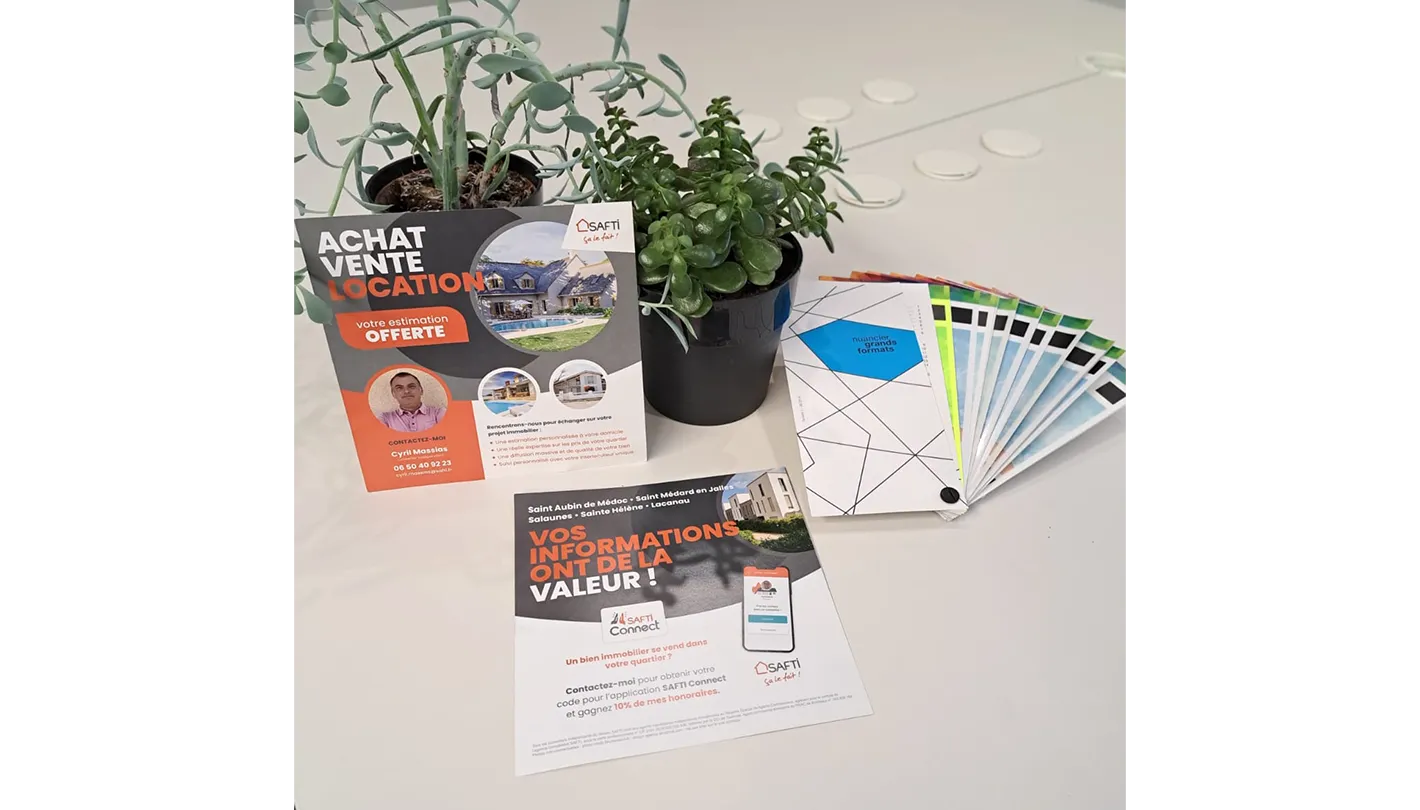
- Lost edges : To avoid any cutting anomalies after printing, allow a few millimetres extra (margin).
- Paper quality : Find the right grammage (generally 135 to 300 g/m²) for a professional finish.
- Innovative printing techniques : Selective varnish, hot foil stamping, rounded edges... these finishes can make all the difference, as long as you keep your budget under control.
In the case of Safti Immobilier, the aim was to combine quality and profitability. We therefore recommended paper thick enough to make the agent's photo and key information stand out, without blowing the marketing budget. The visual harmony was reinforced by sober colours, consistent with Safti's identity, and uncluttered text to emphasise the message.
A communication medium that inspires confidence
With this Safti Immobilier flyer, the brand is betting on customer relations and effective prospecting in the field. The detailed layout (hierarchical headings, prominent photo, contact details visible at a glance) ensures that the flyer is quick to read and the message easy to remember. The agent becomes the face of proximity, while the meticulous design and print finishes convey an image of seriousness and expertise.
By combining the right aesthetic, quality finishes and a people-focused approach, this flyer is guaranteed to leave a lasting impression on the minds of future sellers and buyers, reinforcing the reputation of the Safti brand.