How to design your brand for China
You've finally decided to sell your product on the Chinese market.
Why not ? After all, China has 1 billion consumers, a booming economy and an increasingly sophisticated market. Enough to thrill anyone with the entrepreneurial spirit. But you know very well that this diversification remains risky. And this for many reasons which include the design of your brand.
So how do you adapt to the Chinese market?
- Make sure you hire a professional to translate your brand name effectively into Chinese, taking into account its phonetic implications and literary meaning. A simple literal translation can have catastrophic results.
- Unlike the West, the Chinese process information differently. They process general information first and then analyse the details.
- As you can imagine, colour and symbolism differ in meaning from the West. For example, the colour red is considered lucky in Chinese culture and the apple is a symbol of peace. Research the colours and symbols of your brand. This may lead you to make changes to your design but also to identify communication opportunities.
- Do in-depth research on what your brand means to the Western market and translate that to the Chinese market to see what might be misunderstood. Keep in mind that you may need to seek help from an expert.
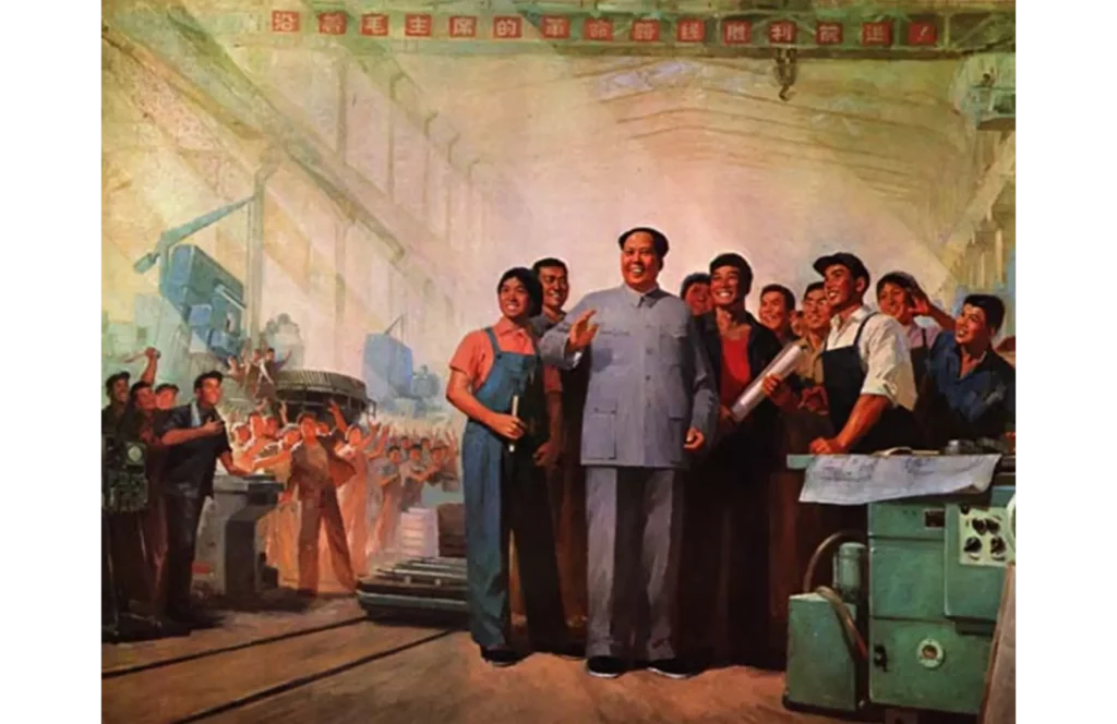
When we think of design, we don't necessarily think of China as being one of its main historical contributors, and wrong. It was in China that printing and paper were invented. This led to China having its own aesthetic, calligraphy and interpretation of visual content.
The reason why China is not associated with graphic design and art is because of the cultural revolution. During this time any visual support not originating from the State was prohibited. But times have changed, and China has opened up to the free market. Which, for Chinese companies, has led to problems to overcome. For example, adapting the design to their cultural heritage while being modern, a balance that is not always easy to find. Today, Chinese companies are eager for young, contemporary talents who can effectively communicate their company's values.
TYPOGRAPHY
Why is typography so important in China?
For brands in China, typography and its naming are an essential part of design for the simple reason that the visual appearance of the brand name and the meaning are completely inseparable. If the Chinese brand name is not investigated, the repercussions can be quite serious and often results in failure to penetrate the market.

Typographic 'failures
When entering the Chinese market, Coca Cola defined its Chinese name as 啃蜡 (Kēdǒu kěn là) which is phonetically correct but translates to "bite a wax tadpole". They later changed their brand name to 可口可乐 (Kěkǒukělè), which means "tasty happiness" and which suits Coca-Cola's marketing much better.
Mercedes Benz is another example. The "Mercedes" part of the brand is difficult to pronounce in Chinese and has no meaning. It is for this reason that the automaker decided to adopt the Chinese name of 奔驰 (Bēnchí), which means "top speed". A memorable, beautiful and meaningful brand name.
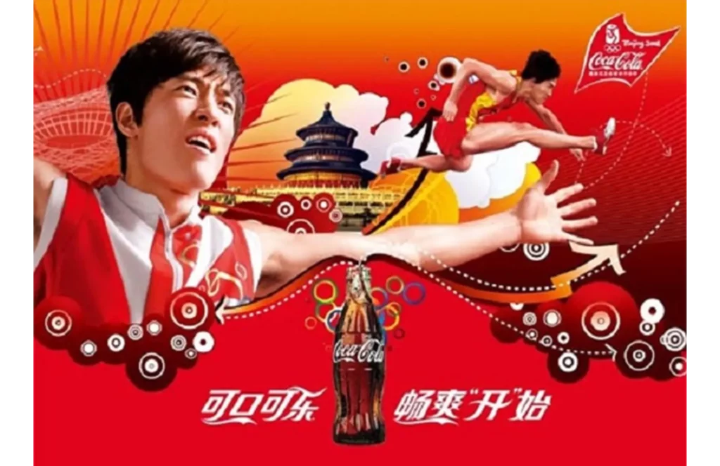
Successful typography
Once the name is defined, the visual identity of the brand and the meaning of the brand will be merged. This can easily harm your brand if executed poorly. However, if done well, the ability to convey the meaning and values of your brand is exceptional.
SYMBOLISM
Symbols from China
Through the prism of different cultures, symbols and their meanings can vary considerably.
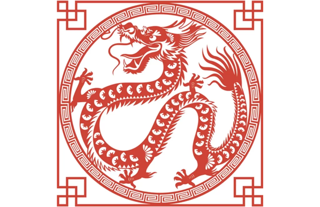
Green is associated with positivity in Western culture and red with negativity, while in China, it is the opposite. Red is associated with luck and good fortune and green is associated with exorcism and infidelity. In China, round shapes are generally associated with reunion, harmony and unity because they are more organic, while geometric shapes with sharp angles are negatively associated and considered unsightly. And these are just a few of the more obvious different interpretations.
China is a country extremely rich in culture and history, and it is for this reason that we recommend careful study of the interpretation of certain symbolisms that could relate to your brand.
MAIN DIFFERENCES BETWEEN EAST AND WEST
From the largest to the smallest
The Chinese tend to think from the most general to the most detailed, while Westerners do rather the opposite. For example, this can be seen in the way the Chinese write their name (last name then first name), but also in the way they present the date (year then month). This sequencing can be translated into your brand's visual identity in order to better adapt to your Chinese customers and maintain clear and clear communication.
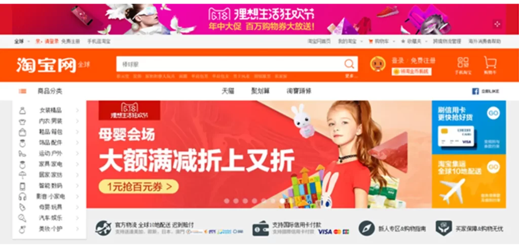
Information consumption
In the West, visual information is transmitted in a lighter and more refined manner with the emphasis placed on the main aspect of the message. While in China (and Asia in general), the media are much more loaded with information. This is due to several reasons:
- Firstly, Chinese characters take up less space than Latin characters and all Chinese characters have a square shape, regardless of their complexity,
- Secondly, because information is consumed differently, the Chinese tend to browse and consume much heavier content on a single page with smaller images. In other words, when designing your interface, don't hesitate to use lots of elements.
The design principles apply
This may all seem complicated but there is good news. Even if they are interpreted in different ways or with different emphasis, the principles of design still apply and can even be completely transposed from one audience to another.
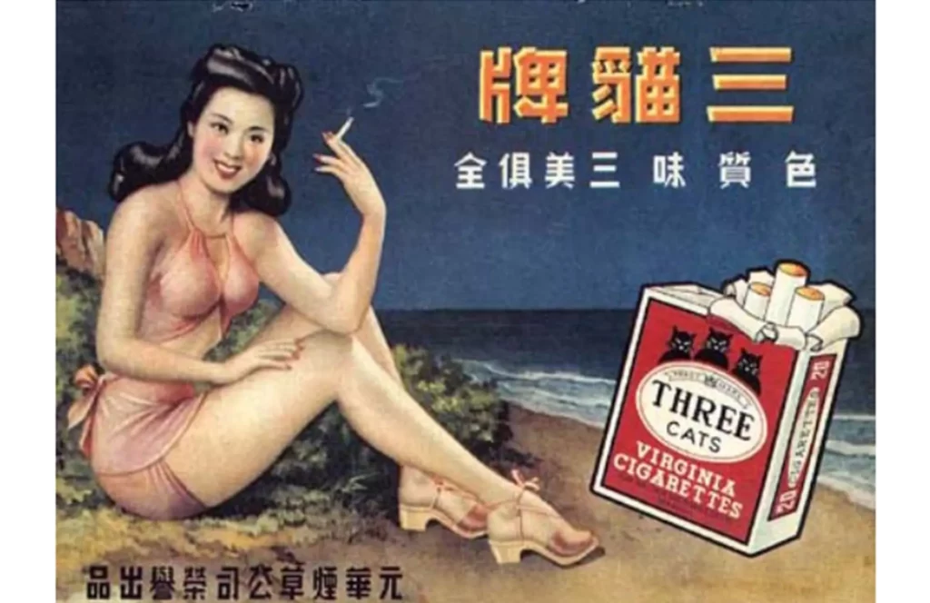
Do you need help to tackle the Chinese market? The answer is... probably. If it's essential for your brand to be easily identifiable or if you're in a competitive segment, particularly with Chinese brands, there will be subtleties to take into account to create effective branding in this market. It is therefore risky to try and do everything in-house without any knowledge of these concepts.
In case you are establishing your brand, don't forget that certain Western elements will also be an asset. Indeed, a “European” touch is a guarantee of quality in the perception of Chinese customers. So, adapt your brand enough so that your values and your message are optimized for your audience, but not to the point where the brand identity is completely erased.
Do you believe that your future Chinese customers will appreciate your touch of exoticism?
