
Packaging: your communication trump card!
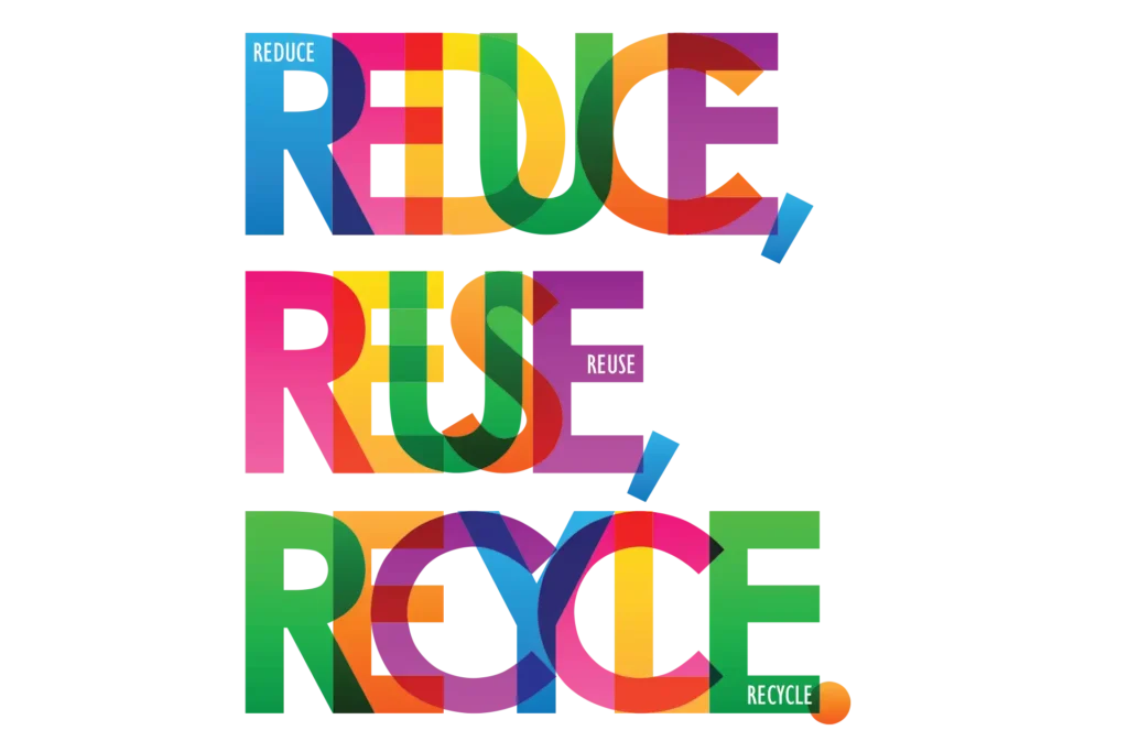
As you will no doubt have noticed, with the growth of ecological issues, the trend today is towards bulk packaging. Although these new concerns and consumer habits should not be overlooked, traditional packaging remains essential in many cases, whether for technical or commercial reasons.
The role and functions of packaging
For some people, packaging only exists to look pretty. However, most of the time its primary function is a technical one: whether to contain a liquid, protect a fragile product, help preserve a foodstuff, enable or facilitate its use by the consumer (as is the case with the famous Flanby tab, or the Pom'Potes propeller caps that make it easier for children to open their water bottles)...
The pack also has commercial and marketing functions. Although secondary, these are the ones that require the most strategic thinking, because packaging is your primary communication tool (the one you can't do without because of its technical functions, and which is therefore in a sense "free") and it allows you to convey a considerable amount of information. In my opinion, this is the most important role from the brand's point of view, especially in supermarkets where your customers don't get buying advice and where competition is fierce. In this case, a well-constructed pack can make all the difference!
Your packaging will enable you to convey different messages such as :
✔️ Identify your brand name, image and positioning.
✔️ Communicate your strategy.
✔️ Information your consumer on the product itself, its composition and its use.
✔️ AttractThis can be achieved by making your product stand out from the competition and/or by creating a specific appeal and emotion for the consumer. Packaging with sufficient impact will be a real vector for your brand image and will help to improve your reputation.

Source : aesop.com
For example, the Aésop pack, although extremely sober, conveys the brand's key messages:
✔️ The brand name: the first visible piece of information that stands out from the rest
✔️ The transparency strategy is clearly displayed by putting the list of ingredients on the front of the product, whereas this information is usually on the back.
✔️ The use of black and white conveys both the simplicity of the brand and its slightly premium positioning.
How can you ensure you develop striking packaging?
As a brand, you will mainly have to manage the key stages of thinking about and designing the graphic chain during the development of the pack, but you will also have to manage the document control stages during the printing phase. It's a bit tedious, but you shouldn't neglect it, because you're the one who knows your pack best, so you'll be in the best position to spot any potential mistakes. And above all, if there's a problem with the final result, you'll be the one who suffers!
Draw up an exhaustive brief to guide the graphic design process
This involves thinking about the strategy that your pack should convey and centralising everything in a set of specifications to guide your graphic designer in its design. In our experience, we often try to move as quickly as possible on the graphics, but without having validated (at least in part) the format of your pack, there's not much point in starting to think about it in depth. The layout and quantity of information will depend very much on the medium: its shape, the surface area available, etc. I therefore recommend that you start by looking at the broad outlines of the format before tackling the design brief in detail.

Define the functional brief to determine which format and materials to opt for
Here is the list of questions I systematically ask myself to refine my brief:
- What should my pack contain?
- What technical functions should my pack fulfil?
- What are my technical constraints in terms of storage, transport, the production line, shelving, etc.?
- What is the maximum unit cost I want to invest?
- What material(s) do I want to use (depending on cost and brand positioning)? For example, in the spirits sector, you may have several options: just the bottle for an entry-level product, the bottle in a cardboard case for a mid-range product, or the bottle in a canister (more solid) for a premium positioning.
- How many colours (including Pantone colours) can/should I use? If you can, use a Pantone colour for your logo to ensure consistency between your different printed materials.
You should also consider the ecological aspect at this stage. Today, there are a number of aspects you can play with to optimise the durability of your packaging, such as the ink or material used (use less material, a material that is easy to recycle or develop a pack that can be reused).
Here is the list of questions I systematically ask myself to refine my brief:
This is certainly the most important aspect of your thinking. You can opt for a standard pack format and material and rely entirely on the graphics to make you stand out from the crowd. This is often the case for entry-level or mid-range products.
The creative brief will then be interpreted by your graphic designer, which is why it is important to be exhaustive about the content you want to see on your pack and to guide the creative aspect sufficiently to be consistent with your brand image.
Start by listing the written content:
- Exhaustive list of compulsory and recommended information (regulatory information, information relating to quality, etc.) + specify the position they must occupy if this is required by law. Remember to define these items clearly first, as they will limit the space available for optional items.
- Name of your brand and product, and logo
- Advice on using and preparing the product...
- Marketing information to tell your story and create a link with the consumer, and any other information you wish to pass on, such as promotional offers, the rest of your range, etc.
Give your graphic designer something to work with:
- Complete graphic charter to be attached to the brief
- Explanation of the context to enable the graphic designer to understand what is at stake: your target and positioning, the reason for the project (new product, facelift, etc.).
- Benchmark competitor packaging to understand the competitive landscape and how to stand out from the crowd.
- If you already have existing products, attach visuals of the packs so that from the outset you can create the harmony and homogeneity that are essential to the brand image, but also provide enough differentiation to clearly understand the construction of your offer.
- If your market and positioning dictate it: the codes to respect. For example, on products such as infant formula, there is a real need to reassure the buyer. So it's essential to respect market codes.
- On the other hand, if you are making a limited edition, if your product is not very engaging or if your brand already has a good reputation, you can allow yourself to deviate from the usual codes, for example Heineken's limited editions for the Euro football tournament, where the brand name is minimised in favour of the participating countries.
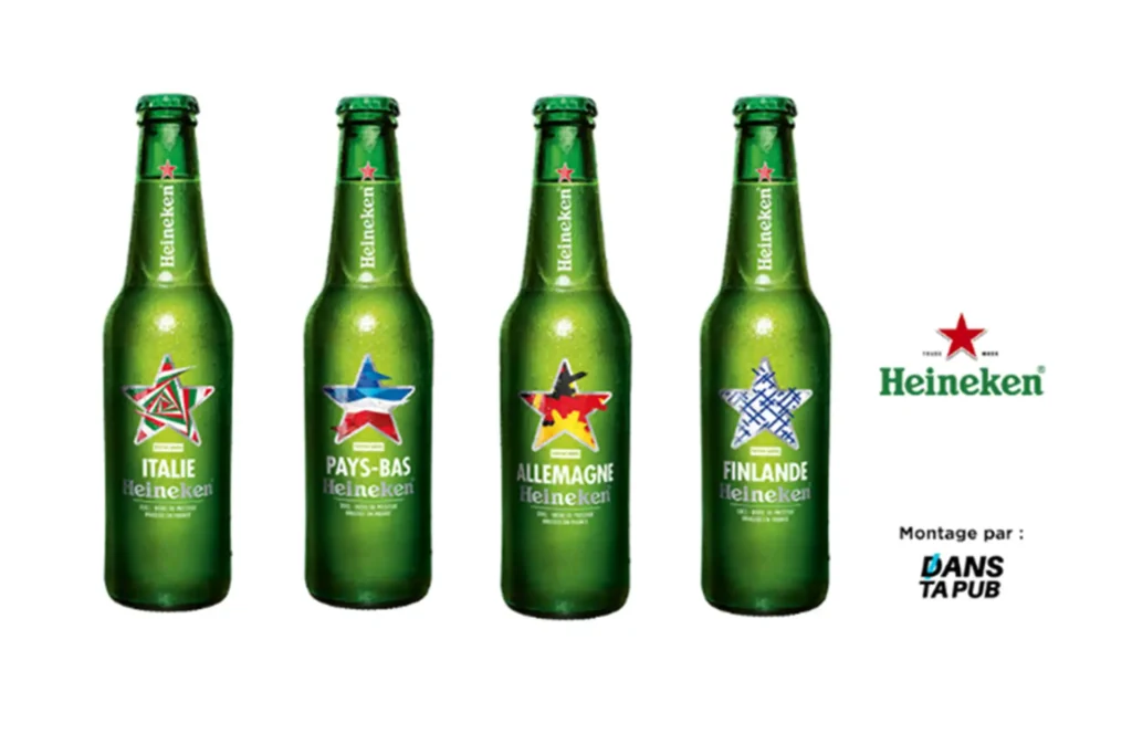
Source : Danstapub.com
Ensure consistency between brief and graphic expression
Throughout the graphic design process, keep your brief in mind: all the elements mentioned in it must appear on the pack. You should also take the time to make a mock-up so that you can see how it will look in 3D at actual size, so that you can judge whether the various elements are visible and legible when facing (you can only see this sort of thing at actual size) and so that you can test the design in a real-life situation by positioning it:
- With the rest of your products to ensure both consistency, so that the consumer makes the link between the different products in your brand, and differentiation, so that they understand that these are different products or even ranges.
- Talk to competing packs to make sure your pack stands out.
Only once all these points have been validated (and you are happy with the design) can you send the file to the printer.
What should you check once your file is in the printer's hands?

Control #1 : Once your file has been adapted by the printer (essential if it is to run on technical machines), remember to check :
- possible skipping of text or image zones (a very regular occurrence, particularly where accents are missing)
- possible policy changes
- the consistency of the pack's construction. Check that one side is not upside down in relation to the others during assembly.
- the number of colours in the document, including the Pantone colour number where applicable.
#2 control : The proof! This is when you validate the colours in your pack by means of a document called a colour output, cromalin or colour proof. For a very strategic project or if you're working with a new printer, I recommend that you go on site for this stage. It will be easier for you to ask for any necessary adjustments. Don't hesitate to take advantage of the proof to check the text and images again, because a validated proof serves as a control base for your printer for the rest of the production.
Control #3 : A final check on receipt of the first production runs, to ensure that everything conforms to the proof, especially if it's a reprint.