The tumultuous history of the WOLKSWAGEN logo
THE IMPLICATIONS OF VOLKSWAGEN'S LOGO CHANGE
I want you to take a moment, and think about why Volkswagen would want to change its logo. It's good ? For those of you who speculate that perhaps this could have something to do with the fact that Volkswagen cheated with the polluting emissions rate of its cars for years, you are absolutely right. This new logo is linked to the scandal which tarnished the reputation of the car manufacturer.
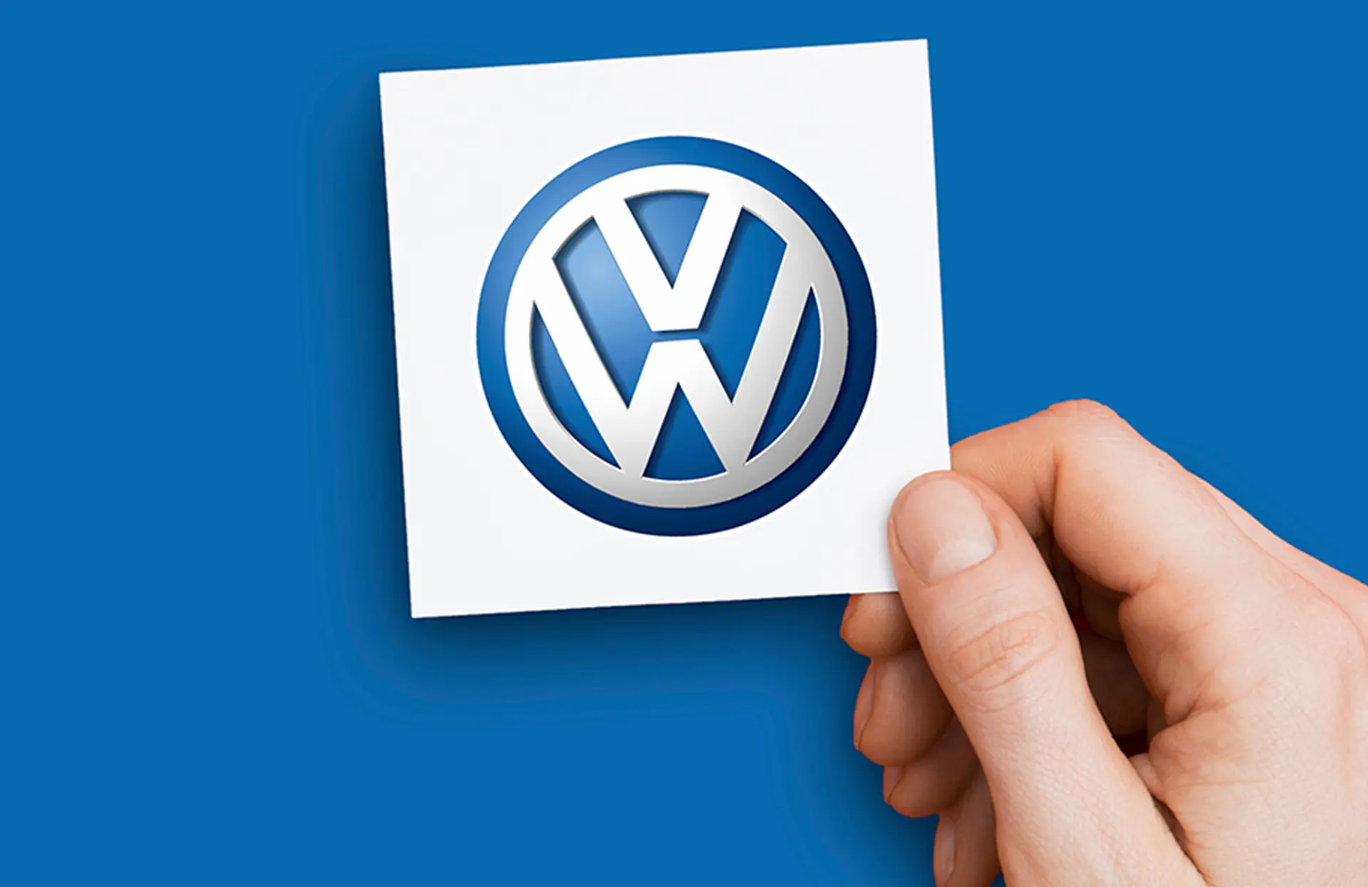
In any case, here's the new Volkswagen logo:

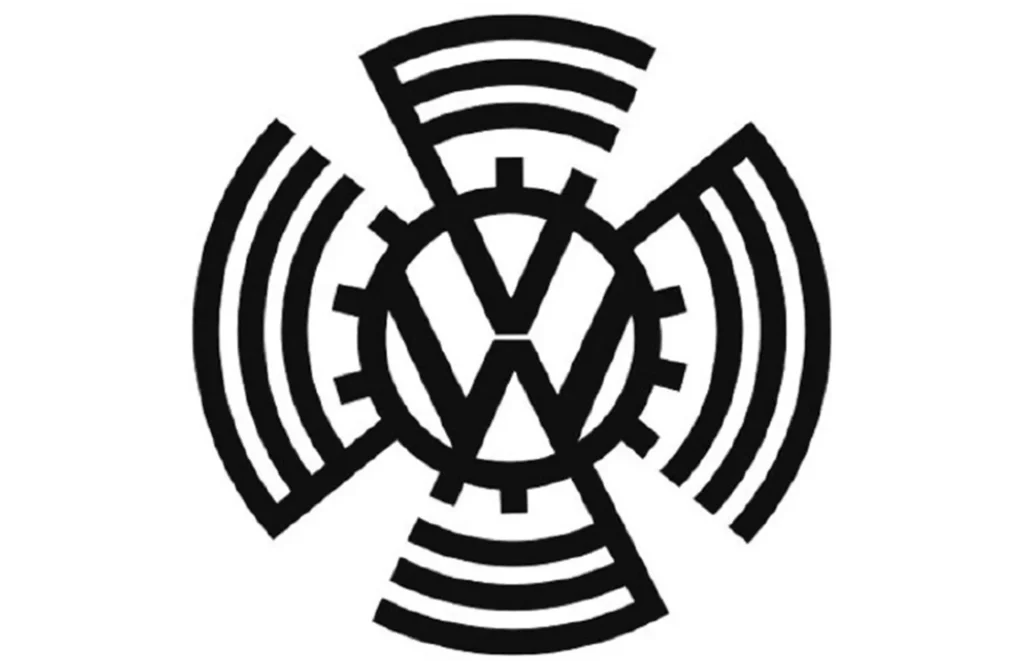
Things have taken a bad turn for Volkswagen since “diesel gate”. An event that destroyed our trust in the brand. This is why renewing new ties with us has become Volkswagen's number one priority, hence the change of logo. By the way, speaking of that, here is the very first Volkswagen logo, and a little nod to Godwin's point.

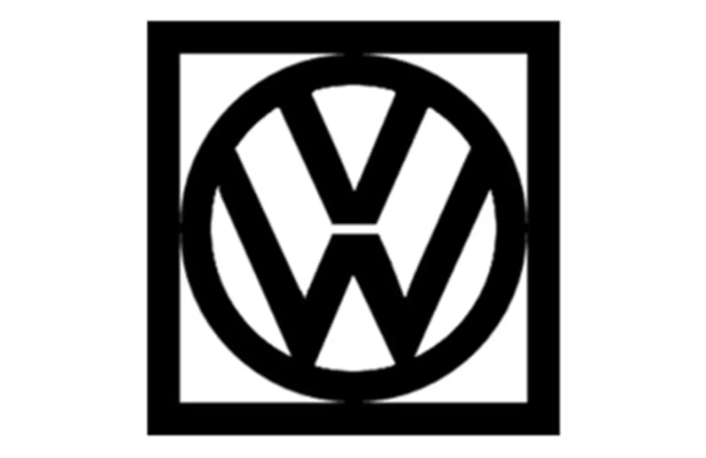
Is there something familiar about this symbol? In 1937 this logo represented the Volkswagen brand when it was created in Nazi Germany. An association from which Volkswagen very quickly separated itself once it became its own brand after the war. Besides, here is their logo in 1960:

The resemblance to the new 2019 logo is striking! Coincidence? We don't think so.
Apparently it is this logo model which is systematically chosen when Volkswagen is on the path to transition (redemption?). If you remember correctly, it was in the 60s that Volkswagen went from being Hitler's car to being the car of the hippies and the peace and love movement, hence the need for a new logo.

Brief ! Volkswagen has once again drawn a line under its past. And to prove it to us, they showed us their new logo at the same time as the ID.3, their new electric and ecological model. A sure way to mark change. But where Volkswagen did well is that they converted this mea culpa into a unique communication opportunity.
THE NEW LOGO
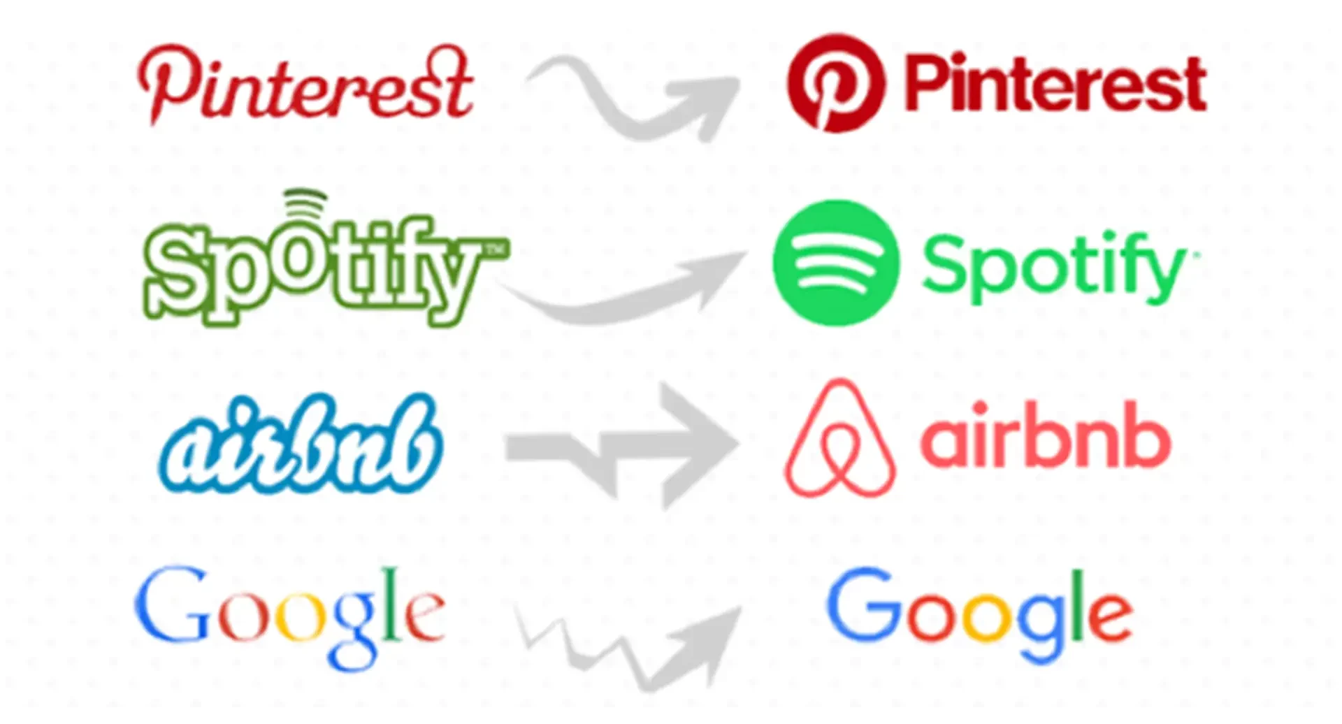
The most contemporary companies of our century are, without a shadow of a doubt, technology companies. They are essential and have a brand image that is human, modern and attractive. Let's look at what they're doing with their logos these days:

Let's compare the old Volkswagen logo with the new one.

The typography and shape of the new Volkswagen logo shares great similarities with Silicon Valley companies. This demonstrates Volkswagen's desire to be more in tune with its era: the digital era. What better for this purpose than to use a simple two-dimensional logo, approachable, but which inspires a certain legitimacy, while being easily transferable from one platform to another. This logo can easily be interchangeable with different color schemes and can be illuminated at your Volkswagen dealer as well as on your car. Just like an Apple product.
MODERNITY
With this new identity come other new attributes; a futuristic electro jingle and a female voice to accompany it. This might seem trivial, but in truth it's quite audacious for an industry that is historically masculine, even associated with misogyny. Here again, a sign that Volkswagen wants to evolve and live with the times. And, whether we agree or not with these changes, the communication made around these elements successfully marks Volkswagen's desire to turn the page. A bet which is risky but which has the merit of modernizing the brand and the automobile industry in general.
Finally, here's a quote from Volkswagen's Marketing Director on these developments: "We have created a new holistic global brand experience across all channels and touchpoints. In principle, the aim in future will not be to show a perfect advertising world. In our presentation, we want to become more human and alive, adopt more of the customer's perspective and tell authentic stories."
And you, what do you think of this story and their branding?
Tell us everything in the comments.
