Hello readers!
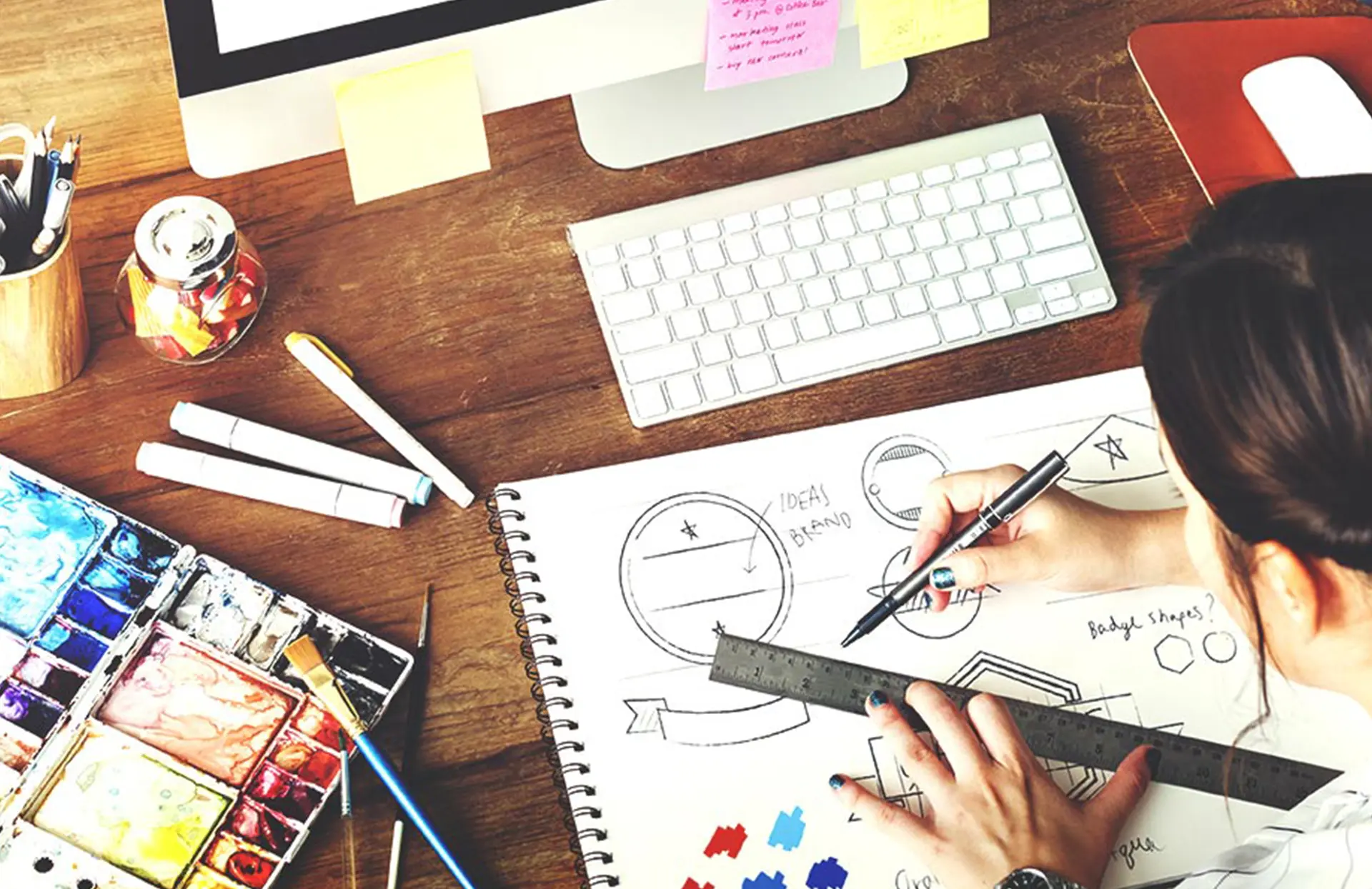
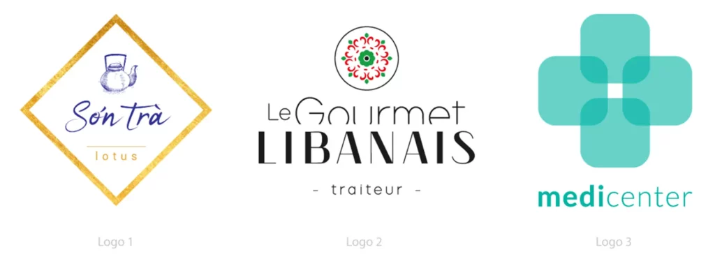
Today I reveal to you all the secrets of making a logo. This is a mission of the highest precision and the end result must be perfect! This is why all aspects must be thought through beforehand. Going through the choice of colors, shapes and the desired emotion. We will end with a podcast on this subject. Sophie Bodineau, founder and graphic designer for What'zhat design Agency, will analyze 3 logos for us.
Now to the real subject.
THE MEANING OF COLOURS
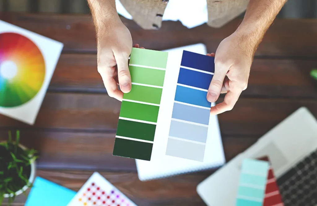
Color is what is noticed first, it will be connected to your brand and visible on all your communication media.
Each color has a meaning, an unconscious connection in the minds of people (especially in Western countries). This is why it is very important to think about the keywords for your business.
– Red represents paradoxes, love/anger, bravery/danger, zeal/prohibition
– Green represents renewal, growth, hope, nature and luck
– Yellow represents light, ego, knowledge, friendship and joy
– Blue represents security, stability, loyalty, wisdom, trust and science
– Pink represents tenderness, romance, femininity and beauty
– Orange represents communication, dynamism, enthusiasm and fun
– Black represents power, mystery, elegance, simplicity and rigor
Attention ! Each psychological association about colors can quickly change depending on cultures, current events, years, personal history and trends.
For more information, please visit these websites: code-couleur.com and Pantone.
THE MEANING OF SHAPES
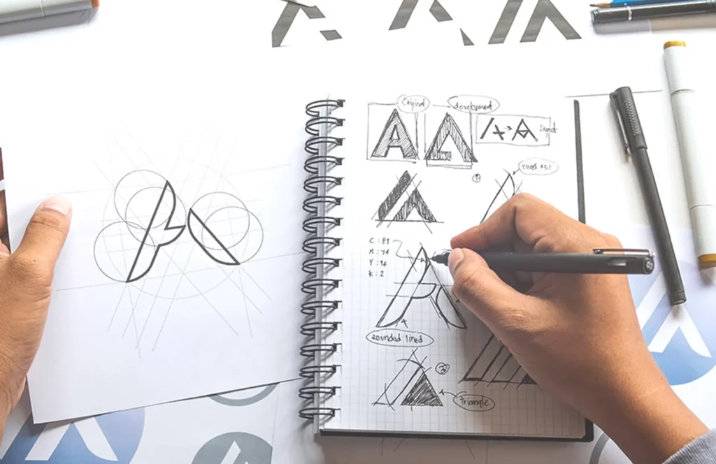
If you use shapes in your logo (sometimes brands only use typography) this will have an impact on the perception of your brand's values and identity. To reach your target you must know how to recognize the brain's unconscious associations about certain shapes.
Here are the most common and what they mean to most people:
– Rounded shapes: welcoming, warm
– Square and rectangular shapes: serious, stable and balanced
– Triangular shapes: power, hard
– Organic shapes: flexibility, natural
– Spiral shapes: introspective, inspiring and continuous
– Vertical lines: hierarchy, superior and strong
– Horizontal lines: communication, calm and serene
The advice is to use shapes sparingly, as too much can make them difficult to understand. A good logo is clear and legible. You can also create shapes without actually adding them, using the positive/negative shapes technique, some examples here.
AN INTELLIGENT MIX
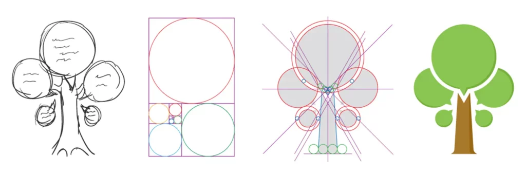
For a logo, anything is possible, any shapes and colors, however a graphic designer will always keep in mind the main message of the company and its key words. This often results in a coherent mixture. In the event that your client absolutely wants a triangle, with sharp angles, while he sells supplies intended for newborns, it is possible to soften everything by adding a very light blue for example. It's all a question of balance.
THE PODCAST
As promised, here's a podcast on the theory of choosing colours and shapes.
WHAT DO THE DIFFERENT TYPEFACES MEAN?
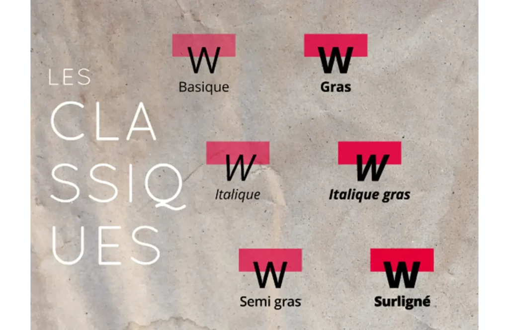
As Wikipedia says, typography refers to the various typesetting and printing processes using raised characters and shapes, as well as the art of using different types of characters to make language legible, attractive and intelligible.. In fact, these are 3 of the main factors we take into account during our meetings with our customers.
First of all, this image will help you understand the differences between typefaces:
However, I can assure you that you don't need to know all these technical words in detail - I know you don't have the time! So I suggest you read on, which focuses more on the psychological aspect of each typeface.
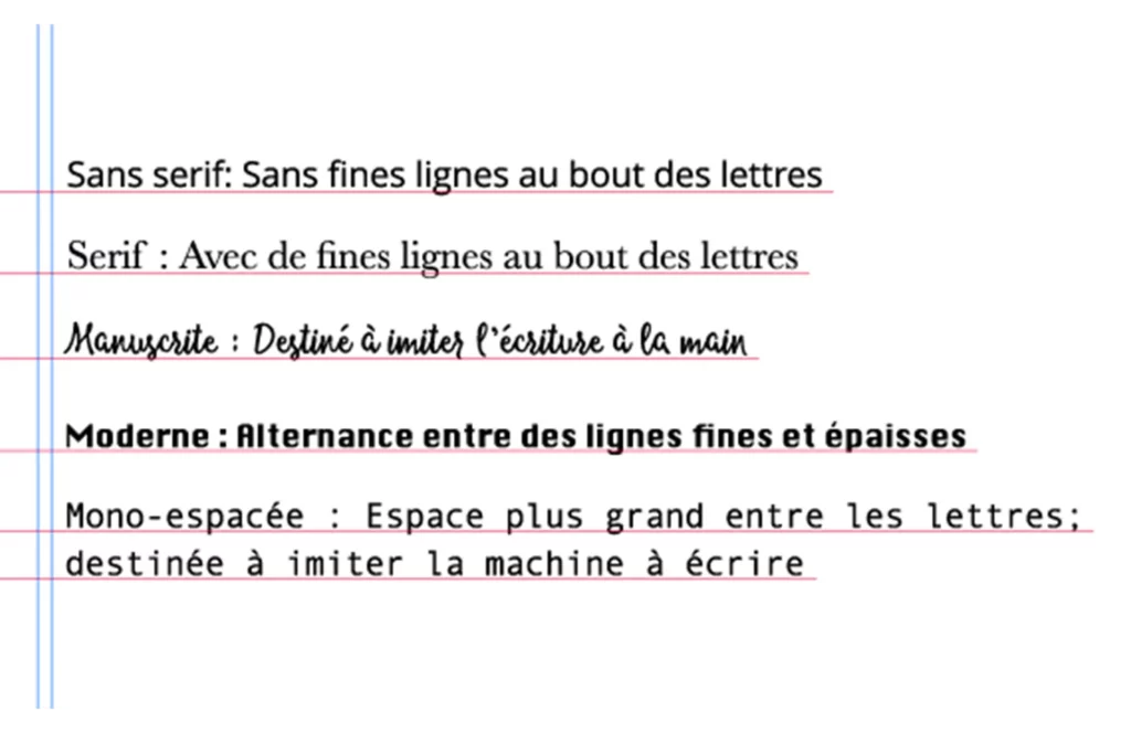
Each font does not pair with any other. Having a good combination will allow you to create depth in your identity (this rule also applies to all your presentation materials and designs, thank me later for the tip). You will find right there, a link to a very good site which will save you from errors of taste. You will also need this website which lets you download your favourite typefaces.
THE IMPORTANCE OF EMOTIONS
After choosing your colors, shapes and typography you will start to get a good first vision of your future logo. However, if you stop here you'll probably miss the best part: the emotions. Nowadays we no longer buy products the way we used to. Customers are looking (unconsciously) for a relationship with the brand. They no longer buy the product only for its characteristics but also for what the brand represents and conveys.
That's why you need to concentrate all the more on your logo. Try to play on one of the 6 emotions recognised by specialists as the strongest: joy, pride, confidence, curiosity, fear and guilt.
For example:
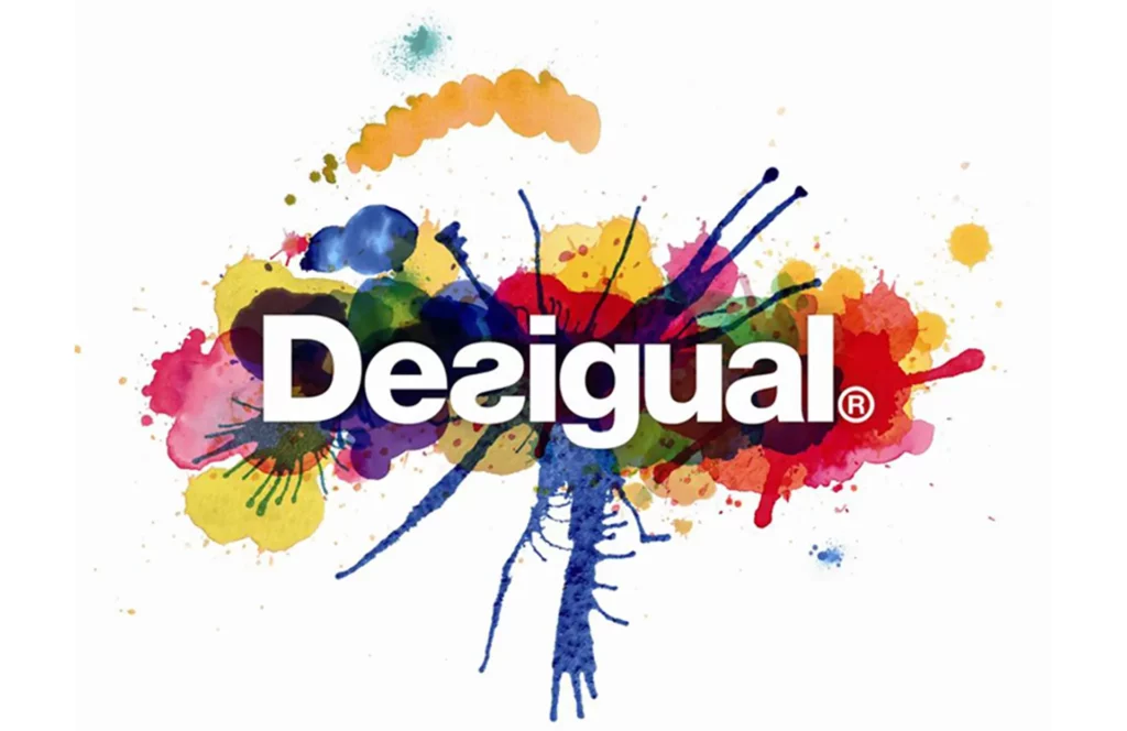
Desigual, a leading ready-to-wear brand, has created a logo that we believe represents many of these emotions very well. Thanks to the very organic shapes that seem to form an explosion of colours, Desigual hopes to arouse the curiosity of its customers. The clarity of these same colours is an obvious invitation to a feeling of joy and celebration.
Finally, the typography, which reverses at times, shows that Desigual doesn't hesitate to go against the grain and impose its sense of pride with a very bold typeface. In this excellent example, we can see that all these elements form a coherent whole that is entirely in keeping with the brand.
YOUR LOGO IS FINISHED!
Now is the time to enjoy your logo and display it everywhere. But remember that time flies! You need to be flexible when faced with a constantly changing environment. As explained above, the meaning of colors, shapes and typos can change overnight depending on events. Don’t hesitate to change or modernize your logo when you feel it’s time. Don't be nervous! Your customers will be surprised in a good way and will talk about you during the coffee break! It is good and positive for them to see that your business is evolving and following trends. Evolve your logo intelligently, follow your strategy already in place and stay in line with your brand image and your values.
For example:
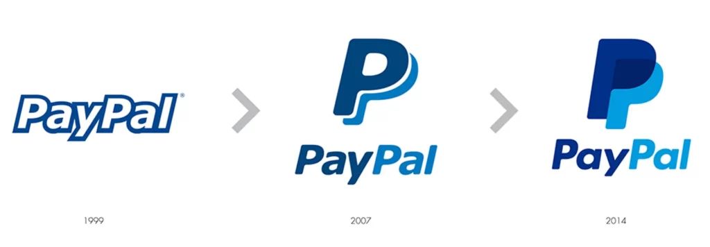
Paypal, which offers online payment methods, has not only evolved its logo in line with its environment and current trends, but also in line with its own history. Back in 1999, very few people were using this service. The Internet was only two years old, so as the company has grown in importance, it has also become more confident in its approach to its logo, with fuller letters, brighter colours and an overall look more suited to a leading company.
